Gallery Walls Without the Guesswork
A simple method for planning a gallery wall that feels personal, not random.

· 4 min read
A gallery wall can feel like the hardest thing in the room to get right. You have a stack of frames, a bare wall, and a nagging worry that one wrong nail will throw the whole thing off. Yet a wall full of art rarely comes from luck or a designer's eye. It comes from a few small decisions made in the right order. Work through them one at a time, and the guesswork mostly disappears.
Choose the anchor first
Pick one piece that sets the mood. It can be the largest frame, a family photo, a textile, or a print with colours you already use in the room. This anchor does the heavy lifting, so let it be something you genuinely like looking at.
The anchor earns its place by giving every other piece a job. Once you know the largest or boldest element, everything else becomes supporting cast. You are no longer asking "does this belong?" for each frame in a vacuum. You are asking "does this sit well next to the anchor?" That is a much easier question to answer.
Place the anchor slightly off centre rather than dead in the middle. A little imbalance feels relaxed and natural, while perfect centring can look stiff. If your wall sits above a sofa or a console, keep the anchor near eye level so it draws the eye where you spend time.
Keep one thing consistent
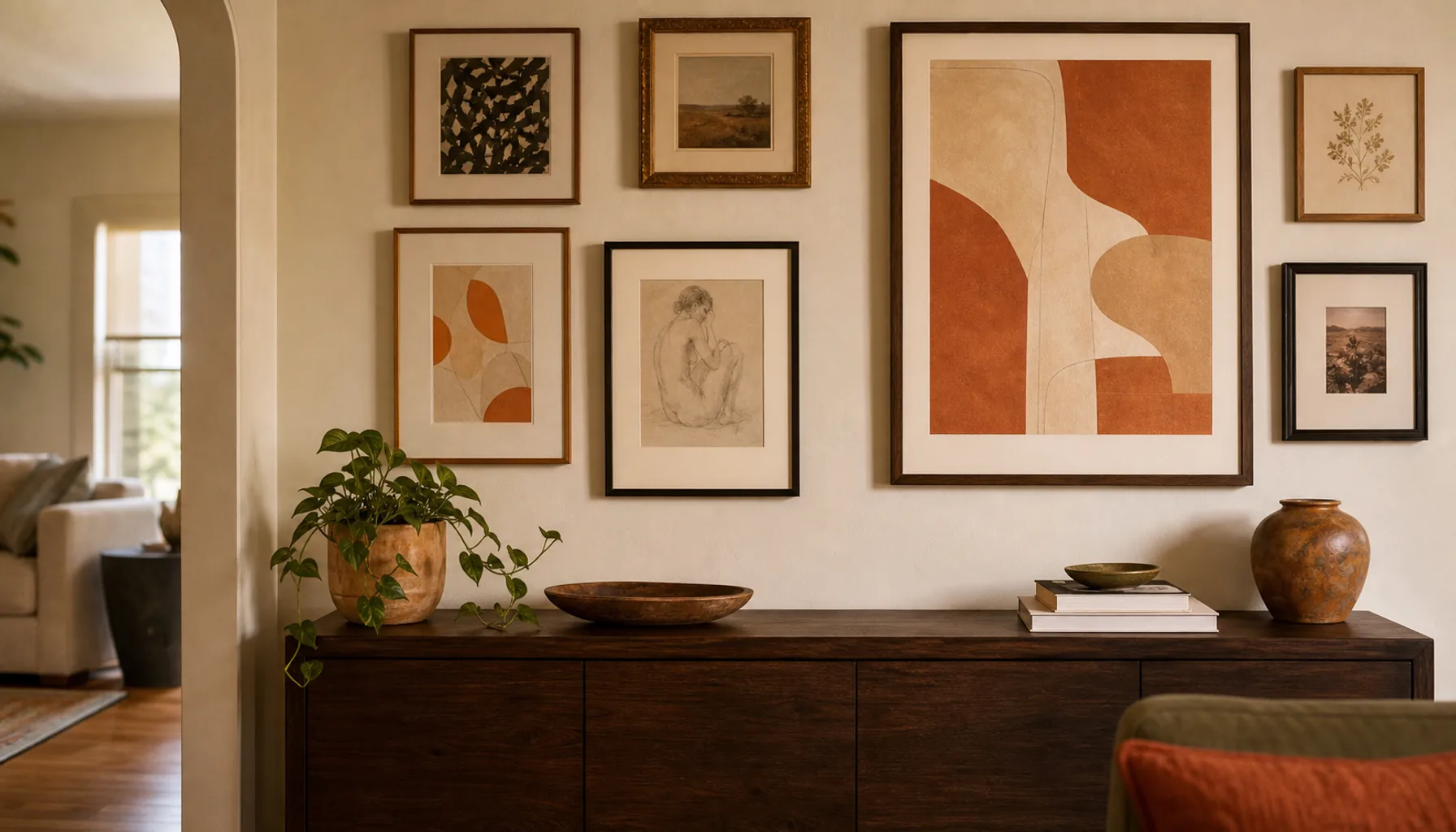
Gallery walls can mix sizes and subjects, but one repeated detail holds it together. Use the same frame colour, the same mat colour, a repeated warm tone in the artwork, or a shared sense of layered texture across the pieces. That single thread is what separates a collection from a jumble.
Think of it as a quiet rule the eye can follow. When frames vary in every way at once, the wall reads as busy and unsettled. When one element repeats, your eye relaxes because it senses order underneath the variety. You can be playful with everything else once that anchor of consistency is in place.
A few easy threads to repeat:
- One frame colour across every piece, even when the sizes differ.
- A shared mat width, so the art feels evenly framed.
- A common colour that shows up in most of the images, like a soft ochre or a muted green.
You do not need all three. One is usually enough.
Lay it on the floor
Do not start with nails. Arrange the frames on the floor and take a photo. The photo makes gaps and awkward shapes easier to see, because a picture flattens the layout and shows it the way the wall eventually will.
Moving frames on the floor costs you nothing. Moving them on the wall costs you holes and touch-up paint. Give yourself permission to shuffle pieces around for as long as it takes. Try to keep the spacing between frames roughly even, somewhere in the range of a hand's width, so the group reads as one shape rather than scattered islands.
When the floor layout looks right, you can cut paper templates to match each frame and tape them to the wall. Step back, live with them for a day, and adjust before a single nail goes in. This one habit prevents most gallery wall regrets.
Leave breathing space
Small rooms do not need every wall covered. A gallery wall looks better when the furniture below it has space to breathe, and when the wall itself has an edge of calm around the arrangement.
Crowding a layout right up to the ceiling or the corners makes a room feel smaller and tenser. A margin of empty wall acts like a frame around the whole group. It tells the eye where the arrangement begins and ends, and it lets the art feel intentional rather than squeezed in. Restraint is doing real work here, even though it looks like doing nothing.
Think about height and light
Hang the centre of the arrangement at roughly eye level, around 145 to 150 cm from the floor for a standing viewer. Over seating, drop it a little so it relates to the people sitting below.
Light matters too. Glass frames can throw glare, so notice where windows and lamps fall across the wall at different times of day. A wall that looks perfect at noon may wash out under a bright evening lamp. Matte prints and non-reflective glass help if glare is a problem.
Personal beats perfect
Use one imperfect piece that means something. A small sketch, a postcard, or an old photo can make the wall feel like home instead of a catalogue. The polished prints give the arrangement structure, but the personal piece gives it warmth.
That is really the whole point of a gallery wall. It is not a showroom display. It is a small record of the things you care about, arranged with just enough order to feel calm. Get the anchor and the spacing right, then let one honest, slightly worn piece carry the heart of it.