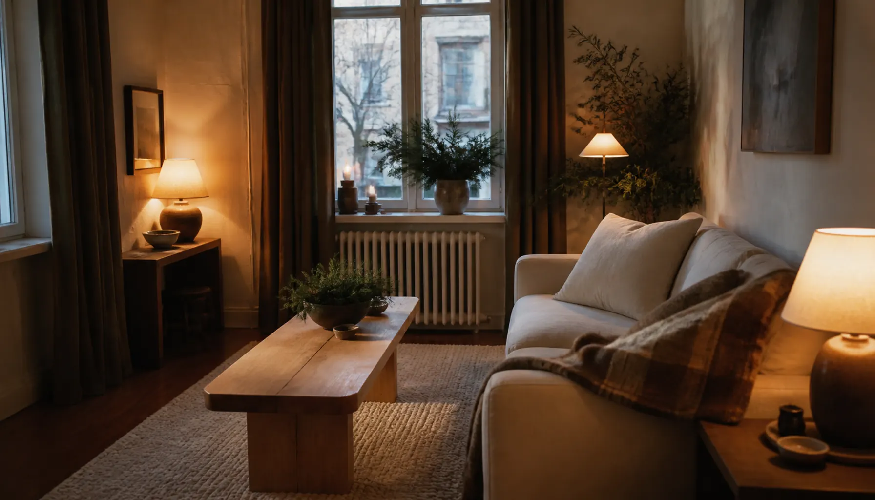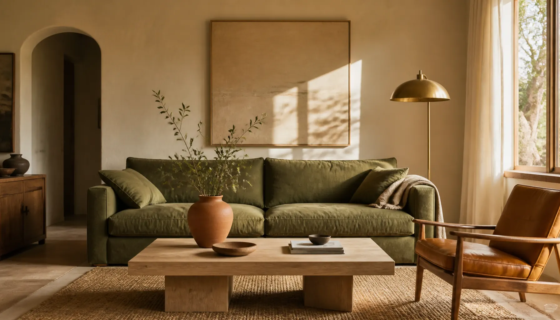
12 Texture Layering Ideas for a Warm Neutral Living Room
Twelve texture layering ideas for a warm living room: where the coarsest weave belongs, how to match sheen instead of color, and when texture reads as noise.
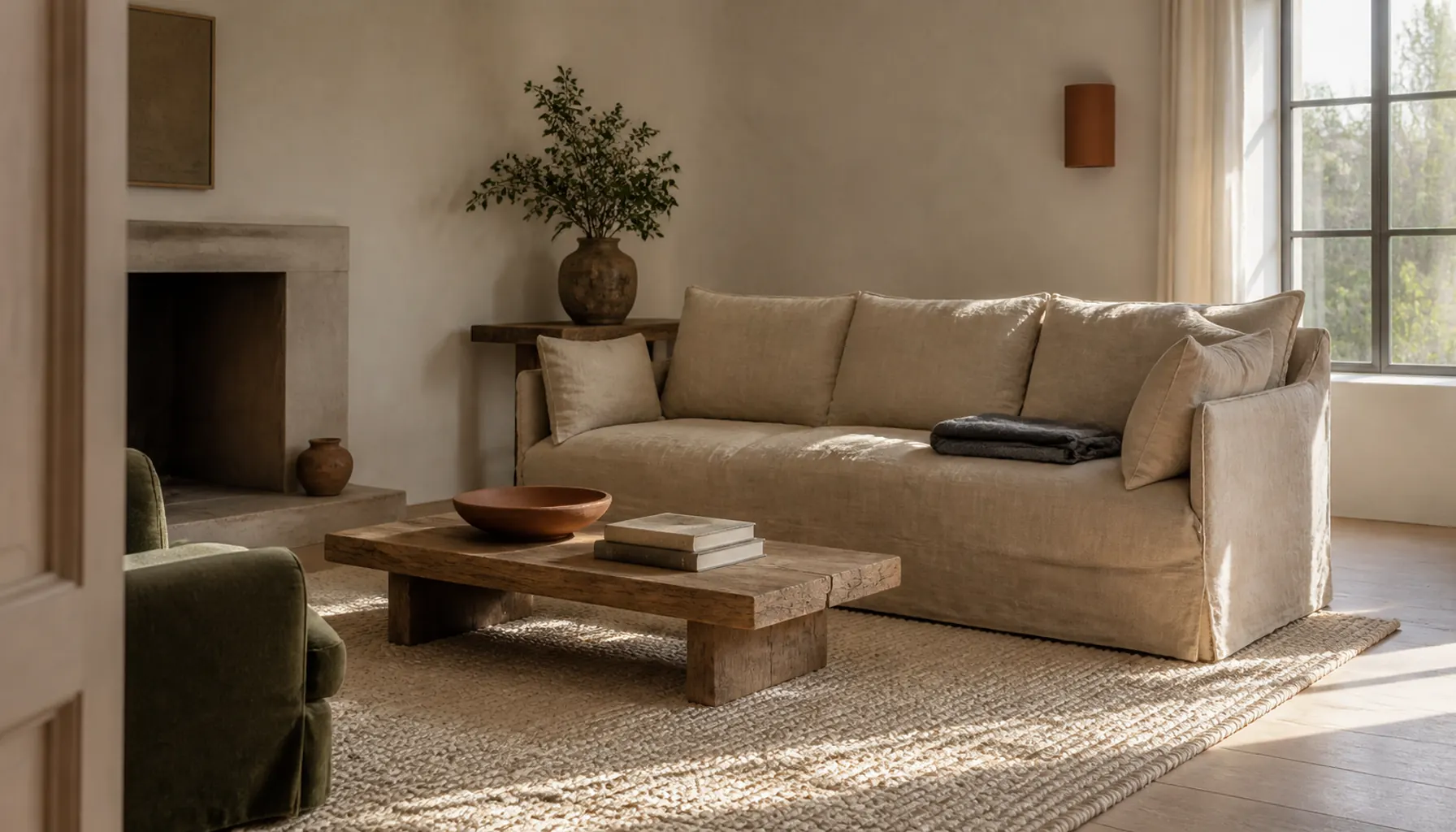

· 14 min read
A living room can contain linen, wool, oak, clay, and jute and still look flat. Texture only works when it lands in the right place, because every surface sits at some height, at some distance from your eye, and next to some other surface. Those three facts decide whether a coarse weave reads as warmth or as a stray object.
If you are still working out what texture is and why contrast matters at all, start with our beginner's guide to mixing textures. That post covers the fundamentals: rough against smooth, how much shine a room can carry, and repeating one material to tie things together. This one picks up where it stops.
The 12 ideas below are about placement in a living room specifically. Which weight of weave belongs on which piece, where the roughest thing in the room should sit, how many surfaces you can run before the layering turns to noise, and a phone test that tells you whether any of it worked.
Key Takeaways
- Assign texture by surface area. The coarsest weave belongs on the largest plane, and the finest goes where hands and arms land.
- Sheen groups objects faster than color does. Three matte things in three colors read as a set; a matte, a satin, and a glazed piece in one color do not.
- Go deep on two surfaces instead of scattering one texture each around the room.
- Rooms run out of texture above the sofa back. Check that plane before buying another cushion.
- A weave must be coarse enough to register from where you see it. A fine slub flattens out across a big room.
- Five or six surface families is the working limit, and you should be able to name the lead one in a word.
- A black and white photo shows the truth, because color stops covering for missing contrast.
12 Texture Layering Ideas Worth Trying
These run from structural decisions to finishing checks. The early ones change what you buy. The last few cost nothing and mostly tell you what to move.
Idea 1: Assign the Coarse, Mid, and Fine Weaves by Size
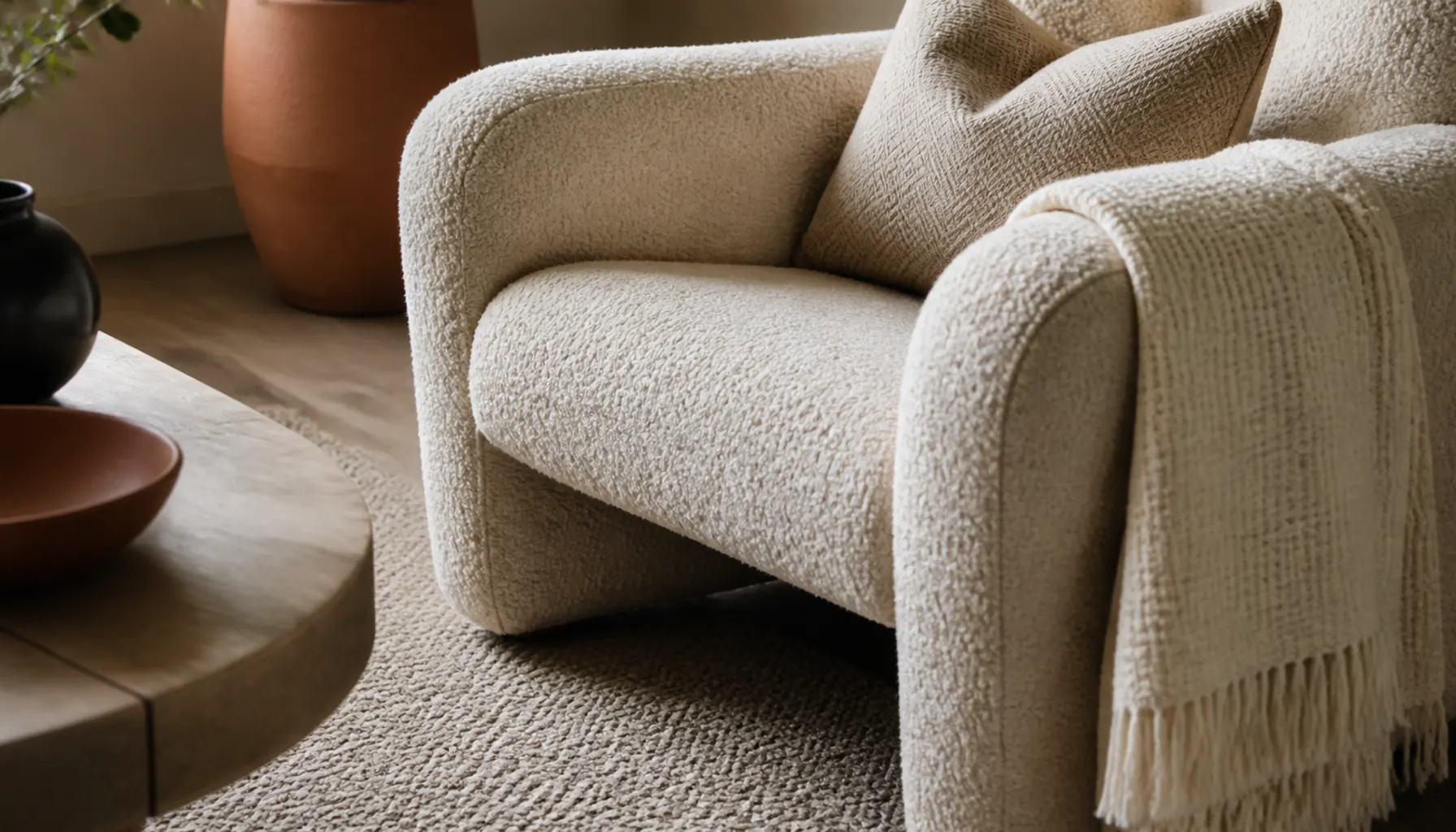
Different weights of texture only help if each one lands on the right piece. Rank your surfaces by area, then match weight to ranking. The biggest plane takes the coarsest weave: a looped wool rug or jute. Mid-sized planes, the sofa body and the curtains, take a medium weave such as slubby linen, heavy cotton, or bouclé. Fine textures belong on the small things your skin meets: cushion covers, a folded throw, a lamp base.
Reverse it and the room feels off for no obvious reason. A chunky knit cushion on a smooth sofa on a flat low-pile rug puts the heaviest texture on the smallest object, so it reads as an accident. Size the rug generously, since it carries the coarse layer; our guide to choosing and sizing a rug covers coverage.
Idea 2: Match Sheen Instead of Color
Sheen is the property your eye groups objects by from across a room, well before it sorts out color. A blackened metal lamp, an unglazed terracotta pot, a limewashed wall, and a wool cushion look related even though none of their colors match, because all four absorb light the same way. A matte basket, a satin frame, and a glossy vase in identical cream will look like three unconnected purchases.
Test it by looking at your shelf or console from the side, toward the daylight. Reflections show up immediately at that angle. Sort what you see into matte, low sheen, and glossy, and you will usually find one piece breaking the group. Swapping a glazed vase for an unglazed one does more for cohesion than repainting anything.
Idea 3: Keep the Roughest Texture Below the Seat Back
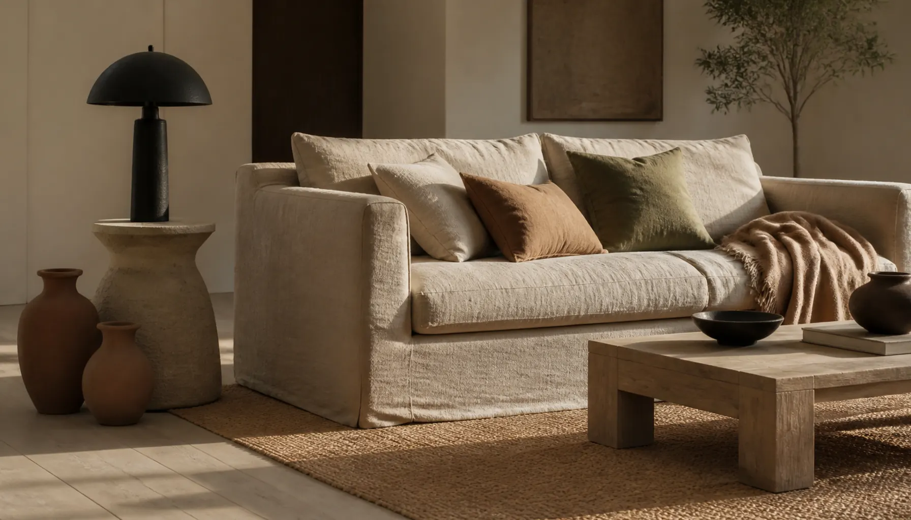
Coarse texture carries visual weight, and weight belongs low. A raw jute rug, a rough timber coffee table, a chunky basket beside the sofa: down there, roughness reads as ground and the room feels settled. Put the same roughness above the sofa back and your eye keeps returning to it as though something is unfinished.
The everyday version is the heavy knit blanket flung over the sofa back. Draped high it reads as laundry. Folded in thirds on the seat, the same blanket reads as texture. One exception earns its place: a wall finish. Clay plaster or limewash puts rough texture across a whole upper surface without a single object, and because it reads as architecture rather than a thing, the eye accepts it.
Idea 4: Go Deep on Two Surfaces, Not One Texture Each Around the Room
Most people distribute texture evenly: linen curtains, a wool rug, a basket in the corner, a knit cushion on a chair. Every piece is fine and the room still looks thin, because your eye reads texture in clusters. A texture standing alone has nothing beside it to be contrasted against, so it barely registers.
Stack instead. Pick two surfaces and layer three textures within arm's reach of each other. A sofa can carry a linen body, a folded wool throw, and two cushions in different weaves. A coffee table can hold a rough wood top, cloth-bound books, and a shallow ceramic bowl. Keep the rest of the room comparatively plain. Depth in two places beats a thin scatter over eight.
Small-Space Tip: In a small living room, make the sofa your one deep surface and stop. Two heavily layered zones in a tight room compete, and you lose the calm that made the layering worth doing.
Idea 5: Let Texture Replace Pattern in a Neutral Room
In a scheme built on cream, sand, and mushroom, texture is the pattern. Every weave has a repeat, and that repeat is made of shadow rather than dye, so it shifts through the day instead of staying fixed. Practically, you can swap prints for structures: a ribbed or waffle weave instead of a stripe, a basketweave or herringbone instead of a check, bouclé loops instead of a dot, a cable knit instead of a printed cushion.
The benefit is not only visual. Woven-in structure never clashes, so you can layer four of them where four prints would fight. If you want a little color in the mix without breaking the effect, our post on terracotta and neutrals works through the proportions.
Idea 6: Check All Four Planes, Not Just the Seating
Living rooms tend to be texture-rich below knee height and bare above the sofa back. Walk the room and check four planes separately. Floor: rug pile, boards, matting. Seat height: upholstery, throws, cushions, poufs. Table height: wood grain, ceramic, glass, paper, plant leaves. Above eye level: walls, curtains, lampshades, shelf contents.
That last plane is where rooms usually fail, and framed art does not fix it, because glass and a flat print are both smooth. What works up there: an unlined linen shade, a limewash finish on one wall, a coarse-linen shade on a tall floor lamp, a raw-edged timber shelf. That sits in tension with the previous idea on purpose. Go deep on two surfaces, but do not leave a whole plane empty.
Idea 7: Give Every Hard Smooth Plane a Coarse Neighbor
Big smooth surfaces are unavoidable: a TV, a glass table top, a mirror, painted cabinet fronts. None is a problem alone. They look cold only when nothing within reach of them has grain.
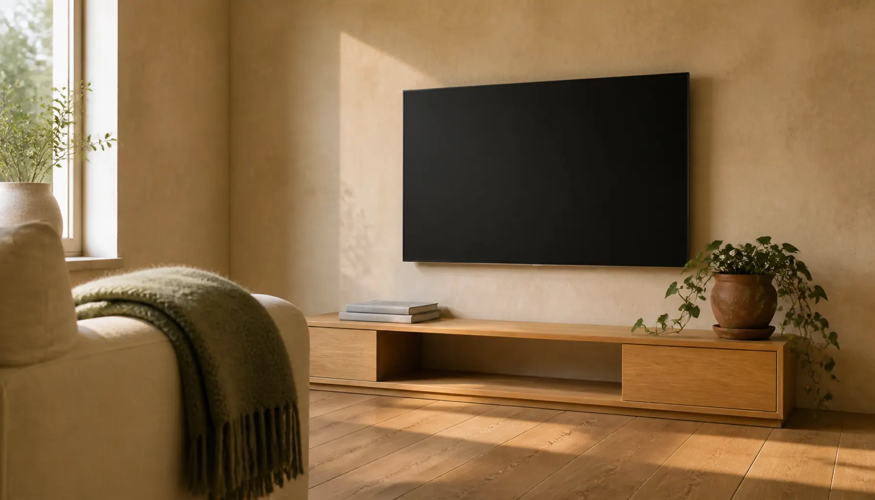
Pair each one at close range. Under a glass top, a rough linen runner gives the glass something to sit against and stops it reading as a floating sheet. Beside a TV, a woven basket at the base of the unit does more than anything hung on the wall, because it shares the same sight line. A large mirror wants a plant or a coarse curtain edge at its border. If your room also has masonry or steel to handle, the wider balance of hard to soft materials is worked through in our warm industrial living room ideas.
Idea 8: Scale the Weave to the Distance You View It From
Texture has a visibility threshold, and it depends on distance rather than on the piece. A fine slub reads as texture from two feet, which is why it works on cushions you sit against. From twelve feet across a large room, the same weave flattens into plain color and the room looks smoother than the shopping list suggested.
So buy by viewing distance. Rugs and curtains are seen from across the room, so they need a coarse loop or a visible weave structure to register. Cushions and lampshades are seen close, so a fine texture is enough. The rule flips in a small room, where the rug sits a few feet away and a very chunky weave feels busy, so a mid-weight loop holds up better. More on that trade-off in our notes on small shared living rooms.
Idea 9: Count Surface Families and Name the Lead One
There is a point where layering becomes noise, and counting objects will not find it. Count families instead: linen, wool, jute, wood, clay, glass, metal, leather, paper, stone. Most living rooms work at five or six and feel restless past seven, because by then no single surface has enough presence to lead.
The faster test is naming. Describe your room's texture in one word. If the honest answer is wool, or clay, or oak, the layering is working. If you cannot answer, you have too many families and not enough repetition of any. The fix is rarely adding. Take one family out and repeat a family you already have at another height, which is how a natural-fiber scheme holds together in the boho living room idiom.
Worth Avoiding: Buying a second coarse natural fiber to fix a room that already has jute. Two similar rough weaves cancel each other out, and you get a busier room with no more contrast than before.
Idea 10: Buy Curtains for Fold Depth, Not Color
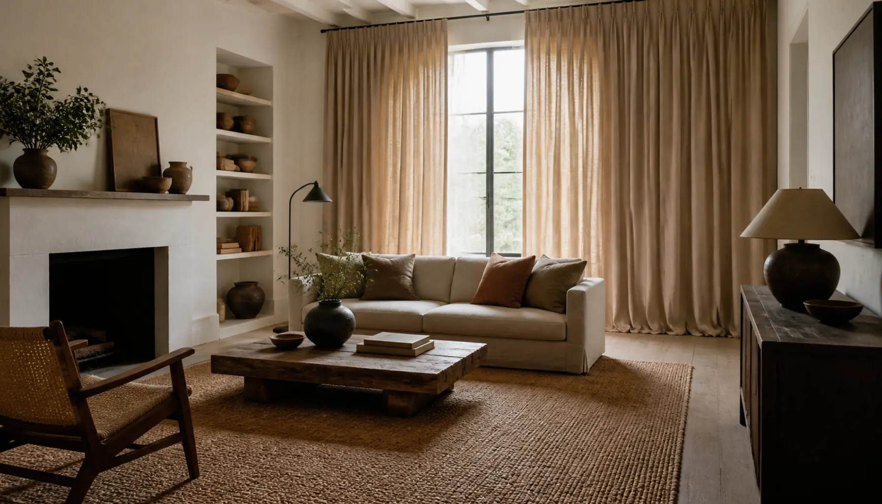
Curtains are usually the largest single piece of fabric in a living room, larger than the sofa, so their weave decides more than any cushion will. What people overlook is that a curtain's texture comes as much from its folds as from its cloth. Fabric with body holds deep vertical folds that catch side light and throw a soft ribbed shadow down the wall. Thin polyester hangs flat and reads as a painted panel.
Two things create those folds: weight (heavy linen, cotton canvas, a loose weave with some stiffness) and fullness, meaning total fabric width noticeably wider than the window so panels gather rather than stretch. Let them break lightly at the floor, since a hovering hem exposes the flat bottom edge. Our window treatment guide covers hanging mechanics.
Idea 11: Style the Surfaces Nobody Counts
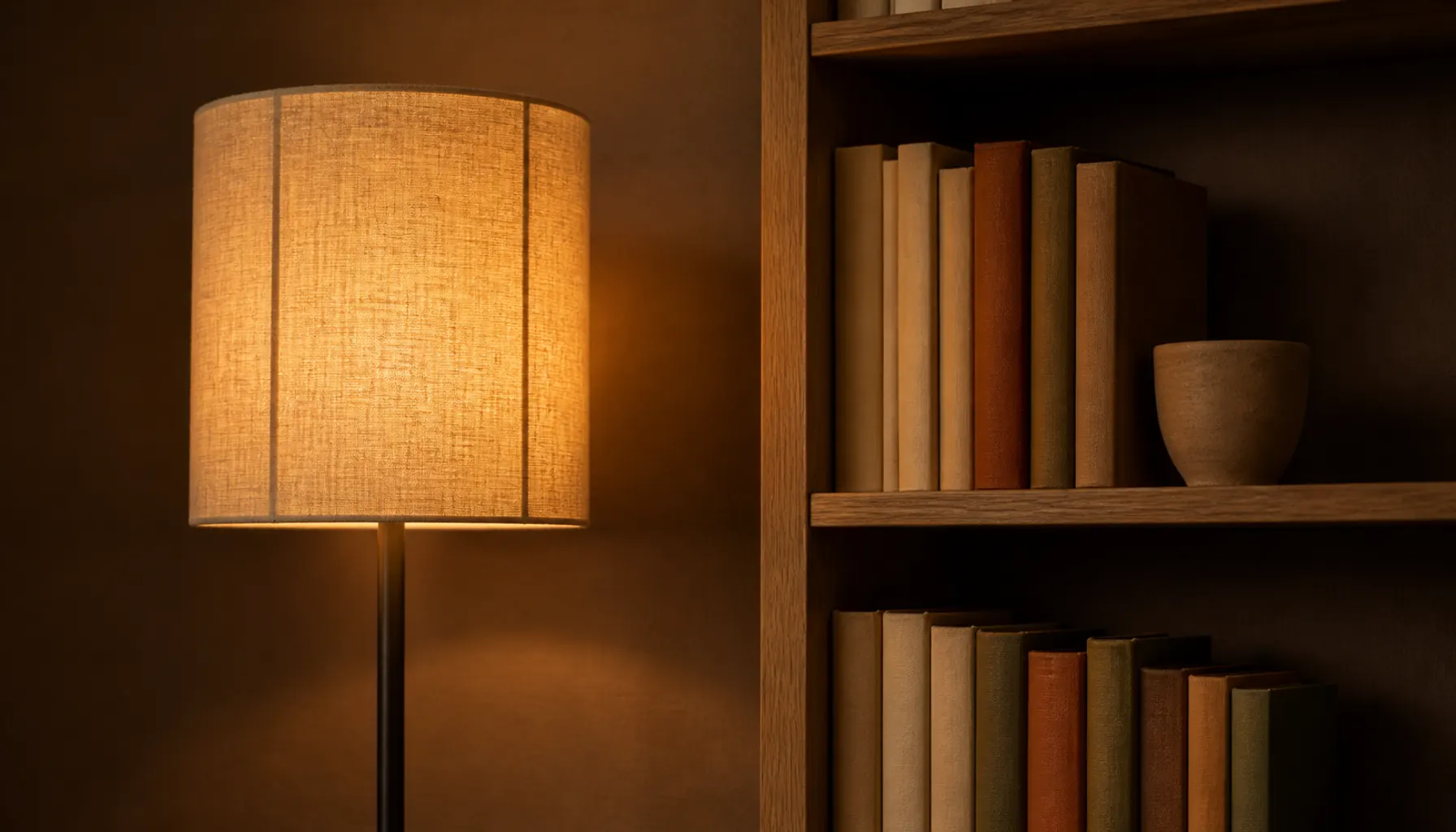
Three textures in most living rooms get styled by accident. First is the lampshade, a large pale surface at eye level and the only texture in the room lit from inside. Coarse linen, rice paper, or a pleated shade glows unevenly and shows its own weave after dark, while a smooth plastic shade goes blank. Second is paper: cloth-bound spines, uncoated covers, and a stack of magazines all read as fine matte texture, which is why sparse shelves in a smooth room feel undressed. Our post on styling open shelves covers arranging them without clutter.
Third is the window itself. Glass is a texture, and the smoothest one in the room, so sheer or unlined fabric next to it is doing more work than it appears to.
Budget Alternative: Reshading a lamp you already own is the cheapest texture change available. Linen or paper instead of plastic changes the whole evening surface of the room, and it avoids the cold lighting mistakes that flatten every other texture you have layered.
Idea 12: Photograph the Room in Black and White
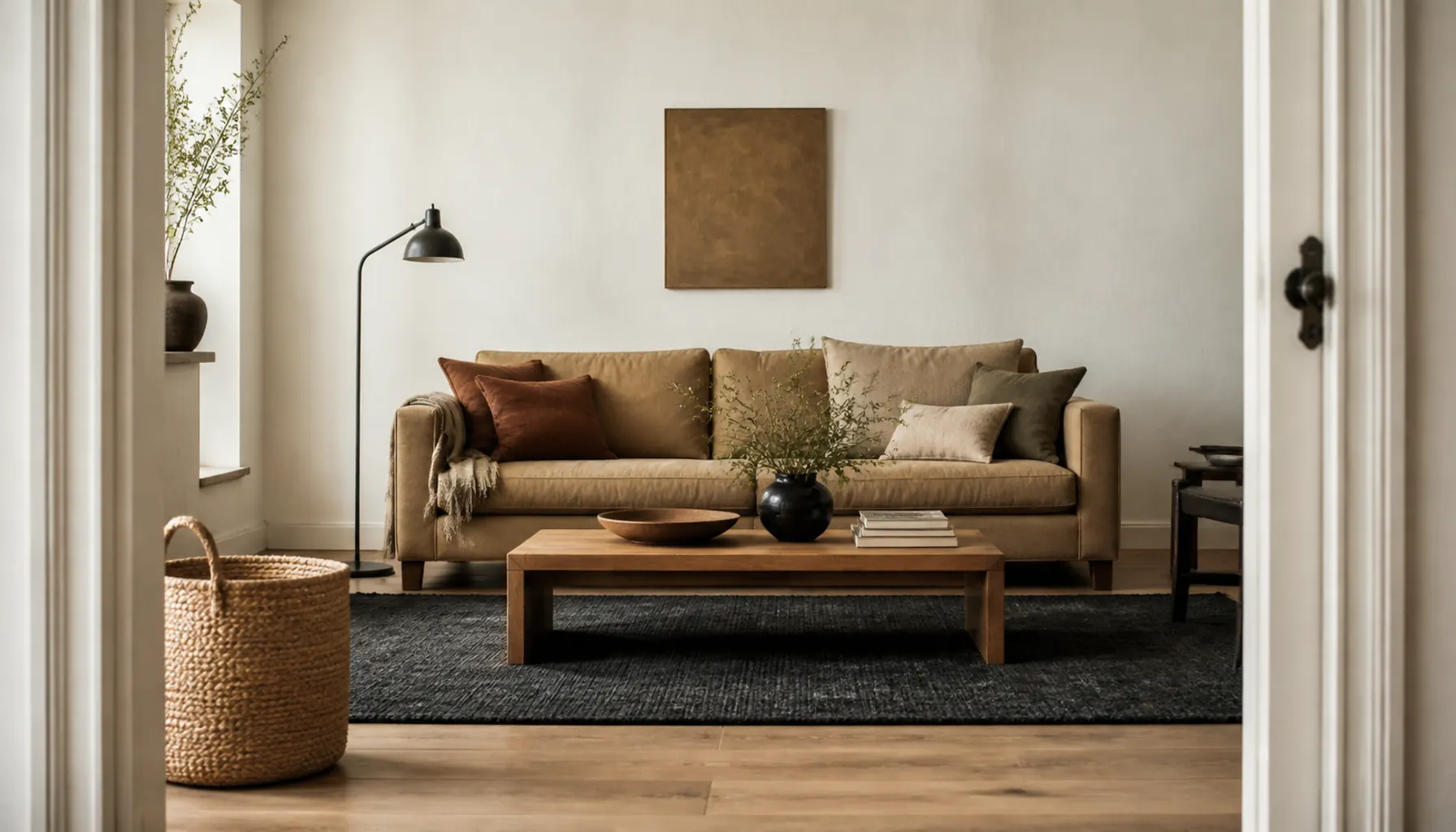
The last test is free. Take a photo from the doorway, then convert it to black and white with your phone's editing tools. Color disappears, which is the point, because color is usually what disguises a room with no real surface contrast.
Look for three things. Whether the picture collapses into one flat middle gray, which means your surfaces all reflect light at the same rate however different they felt in the shop. Whether you can still find the roughest thing in the room, since anything invisible in mono was reading as color, not texture. And whether there is a clear light, mid, and dark in the frame. Shoot it in daylight and again with the lamps on, because raking evening light reveals grain that midday light hides.
Expert Tips for Pulling the Look Together
Put your most textured surfaces on the wall that gets side light rather than the wall facing the window. Light striking a weave at an angle casts small shadows across it. Light hitting it straight on flattens it.
Let one texture hold the room's largest area and never split that job. Two surfaces competing for the lead, say a coarse jute rug and a heavily textured feature wall, leaves neither reading as the anchor.
Repeat a family at a different scale rather than adding a new one. Fine linen in the curtains and heavy slub linen on the sofa are one family doing two jobs, which reads as intent.
Check texture by touch as well as sight. Anywhere forearms rest, so sofa arms and chair backs, should be pleasant to touch. Rough sisal is fine underfoot and unpleasant at elbow height.
Frequently Asked Questions
How many textures should a living room have?
Five or six distinct surface families is a reliable range: wool, wood, clay, linen, and a little glass or metal, for example. Below four the room usually reads flat, and past seven it gets restless because no surface leads. Count material families rather than objects, since ten wool items still count as one family.
Can you have too much texture in a small living room?
Yes, though the usual problem is scale rather than quantity. In a small room you sit closer to every surface, so a very chunky weave gets viewed from a few feet and reads as busy. Keep the same number of families, drop the coarsest grade down a step, and give one surface the lead so the eye has somewhere to settle.
Where should the rug fit into texture layering?
Treat it as the coarse layer, since it is the largest single surface in most living rooms and it is viewed from a distance. That argues for a visible loop, a heavy pile, or a natural fiber weave over a flat smooth one. Size it so it reaches at least the front legs of the seating, or the texture stops before the furniture group does.
What is the fastest way to add texture to a rented living room?
Curtains, a rug, and a new lampshade, in that order. All three cover large areas, all three leave with you, and none need permission. Swapping a smooth shade for coarse linen or paper is the cheapest of the three and changes how the room reads every evening.
Where to Start
Start with the biggest surface you can afford to change, because area is what makes texture read. In most living rooms that is the floor, then the curtains, then the sofa. Those three cover more square footage than every accessory combined, so their weave weights do most of the work.
Then take the black and white photo before you buy anything else. It usually shows that the room needs one coarse surface and less of something smooth, rather than the four cushions you were about to order.
One useful home email a month
Real ideas to make your home work better. No spam, easy unsubscribe.