12 Olive Green Living Room Ideas With Warm Wood Tones
Olive green living room ideas that stay warm, not muddy. How olive differs from sage, which wood tones and neutrals suit it, and how much olive is too much.

· 14 min read
Olive sits in an odd place for a green. There is yellow underneath it, and enough gray mixed in to dull the brightness, so it behaves less like a color and more like a warm neutral. That is why an olive sofa can share a room with tan leather and cream linen and nobody calls it a green room.
The yellow base is also where olive goes wrong. Put it beside a cool blue-gray and it slides toward khaki. Leave it on a wall that only gets weak north light and it looks like army surplus by four in the afternoon.
So the ideas below are decisions rather than mood boards: where olive belongs, how much one room can carry, which wood tones agree with it, and which neutrals leave it alone.
Key Takeaways
- Olive is a yellow-based green. That one fact decides every neutral, metal, and wood you put next to it.
- Cream and oat suit olive far better than stark white, whose blue brightener makes olive look dingy.
- White oak, walnut, and honey pine work. Red oak, cherry, and gray-washed timber fight it.
- Textiles are the cheap way in. Curtains and cushions tell you whether you actually like the color.
- Low light drains olive. In a north-facing room, pick one lighter and yellower than the chip you fell for.
- Cap it at roughly three placements of different size. Olive everywhere flattens the room into one mass.
12 Olive Green Living Room Ideas Worth Trying
Idea 1: Learn to Tell Olive From Sage and Forest Green
These three get sold as interchangeable and they are not. Olive is a mid-depth green with yellow underneath and a little brown or gray knocking the brightness back. Sage is lighter and grayer, with a trace of blue in it, so it recedes and reads dusty. Forest green is deep and blue-based, so it behaves like a dark color rather than a neutral.
There is a quick test. Lay the swatch flat on a sheet of plain printer paper. Olive shows its yellow at once and looks slightly dirty against the white. Sage goes flat and cool. Forest just reads dark.
The distinction matters because sage takes cool grays and blue-toned whites happily, and olive does not. If a dusty sage palette is what you are actually after, our boho living room ideas run that direction.
Idea 2: Set Olive Against Cream, Not Stark White or Cool Gray
Bright modern whites contain a blue or violet brightener. Beside olive's yellow that reads as a mismatch, and olive always loses: it picks up the dull, grayed end of itself while the white looks slightly clinical.
Cream, oat, sand, and warm off-white share olive's yellow base, so the two sit together without either shifting.
Cool gray is the harder problem. A mid blue-gray drains olive toward khaki, and the gray looks bluer by comparison. If you have gray you cannot change, a concrete floor or an existing sofa, push it darker toward charcoal rather than leaving it in the middle, then put something cream or camel physically between the two. The one main color plus two helpers approach helps you decide which of them wins.
Idea 3: Start in Textiles Before You Commit to Anything Bigger
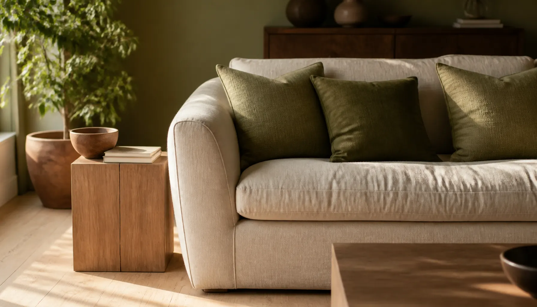
If you are unsure, buy two cushion covers, a throw, and a pair of curtains. That is the whole first pass, and you can undo it.
One thing worth knowing before you order: olive changes with the weave. In linen or cotton canvas it reads lighter and dustier, because the loose surface scatters light. In velvet the pile absorbs light and the same dye looks several shades deeper and distinctly greener. So test olive in the material you plan to commit to, not in whatever is cheapest.
Curtains give the most olive per dollar, and they hang beside daylight where you see the color honestly. Skip an olive rug as a first move: largest area, awkward to return, and at floor level in weak light olive tends to read plain brown.
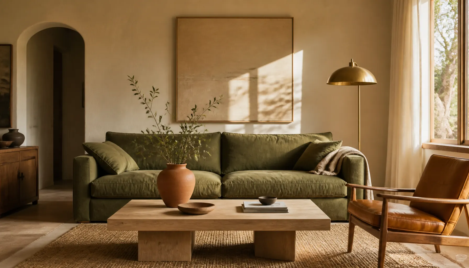
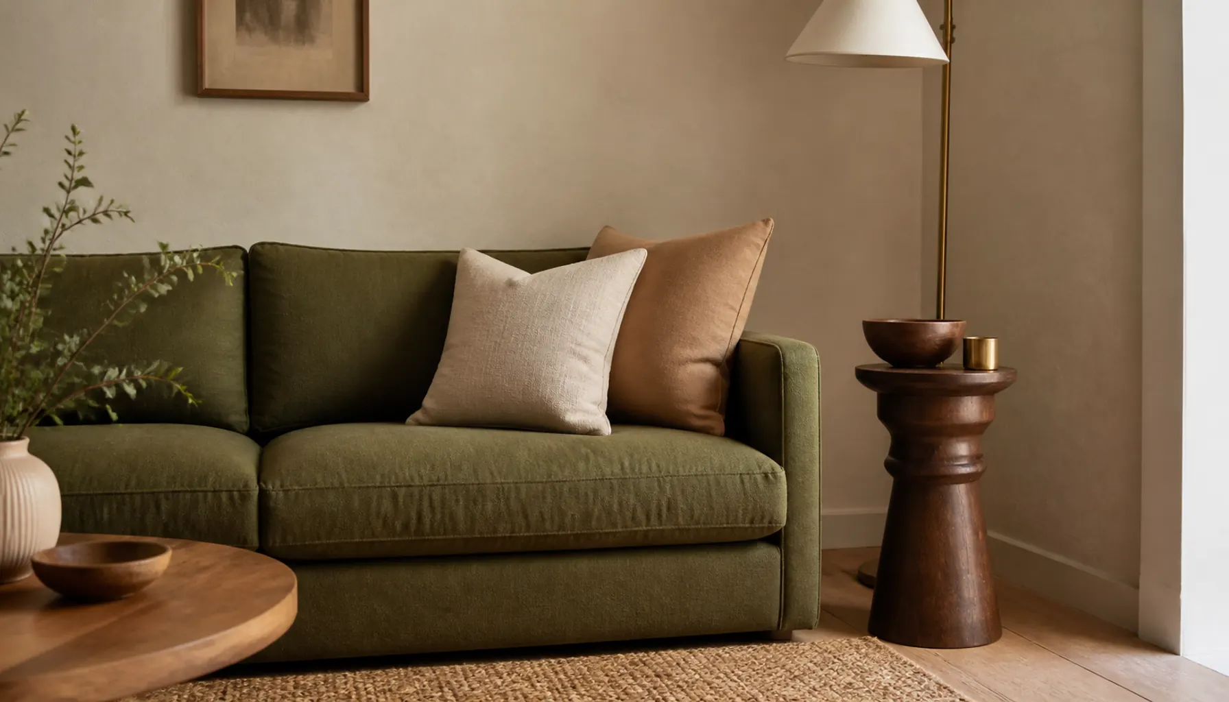
Idea 4: Make an Olive Sofa the One Saturated Thing in the Room
An olive sofa reads as a warm mid-tone, so it hides marks better than cream and looks less severe than charcoal.
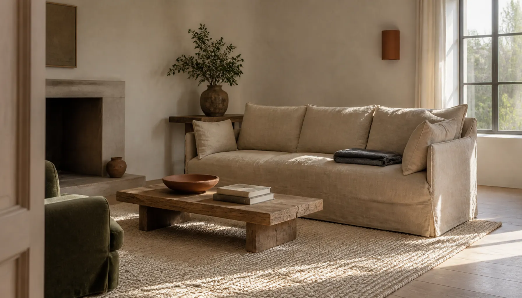
Choose the fabric by how much attention you want it to hold. A flat-woven linen blend keeps it quiet and slightly faded. Velvet turns it into the focal point and shows every fold as a different depth of green.
Then leave the rest alone. Walls in oat or warm off-white, cushions in cream, camel, faded rust, and one black or dark brown. Resist adding more green cushions, which is the most common way this goes flat.
Small-Space Tip: In a small living room an olive sofa often works better than olive walls, because you still see pale wall around it. The color arrives without the room closing in.
Idea 5: Take Olive to All Four Walls, Then Keep Everything Else Quiet
Wrapping a whole room in olive works best where there is decent daylight and a reasonable amount of trim and joinery to break up the color.
Sheen decides whether it looks like pigment or plastic. Matte holds olive as a soft, chalky field. Anything with gloss bounces green reflection across the room and cheapens it fast. For the ceiling, use a soft warm white, or the wall color mixed at about a quarter strength so the corner where the two meet softens.
Trim should be a warm off-white. Brilliant white against olive walls looks chalky and slightly blue. Furniture then needs to be lighter than the walls, or the room turns heavy. This is the same logic behind treating paint as the cheapest structural change you can make.
Idea 6: Paint One Alcove and Stop at the Edge
Contained olive is the lowest-risk version of the color on a wall. Pick the chimney breast, the recess beside the fireplace, or the wall behind open shelving, and leave everything else in your neutral.
It works because the surrounding pale wall frames the olive. Your eye reads it as a deliberate block rather than as the mood of the whole room.
Stop the color at an inside corner or a plaster return, never partway across a flat wall. And go a shade lighter than you would on a full wall: a recess already sits in shadow, so a deep olive there simply disappears.
For renters, one alcove is a small patch to put back at the end of a lease, and an easier conversation than four walls.
Idea 7: Move Olive Onto the Joinery Instead of the Walls
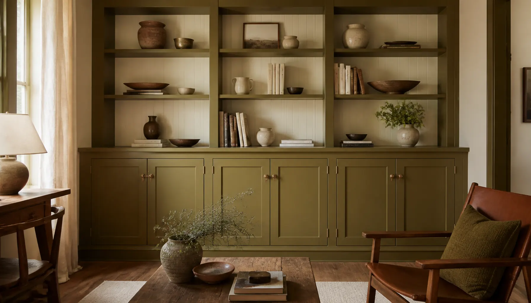
Painted cabinetry reads differently from plaster. Doors, shadow gaps, and hardware break the color into pieces, so joinery carries a deeper olive than a wall of the same shade could.
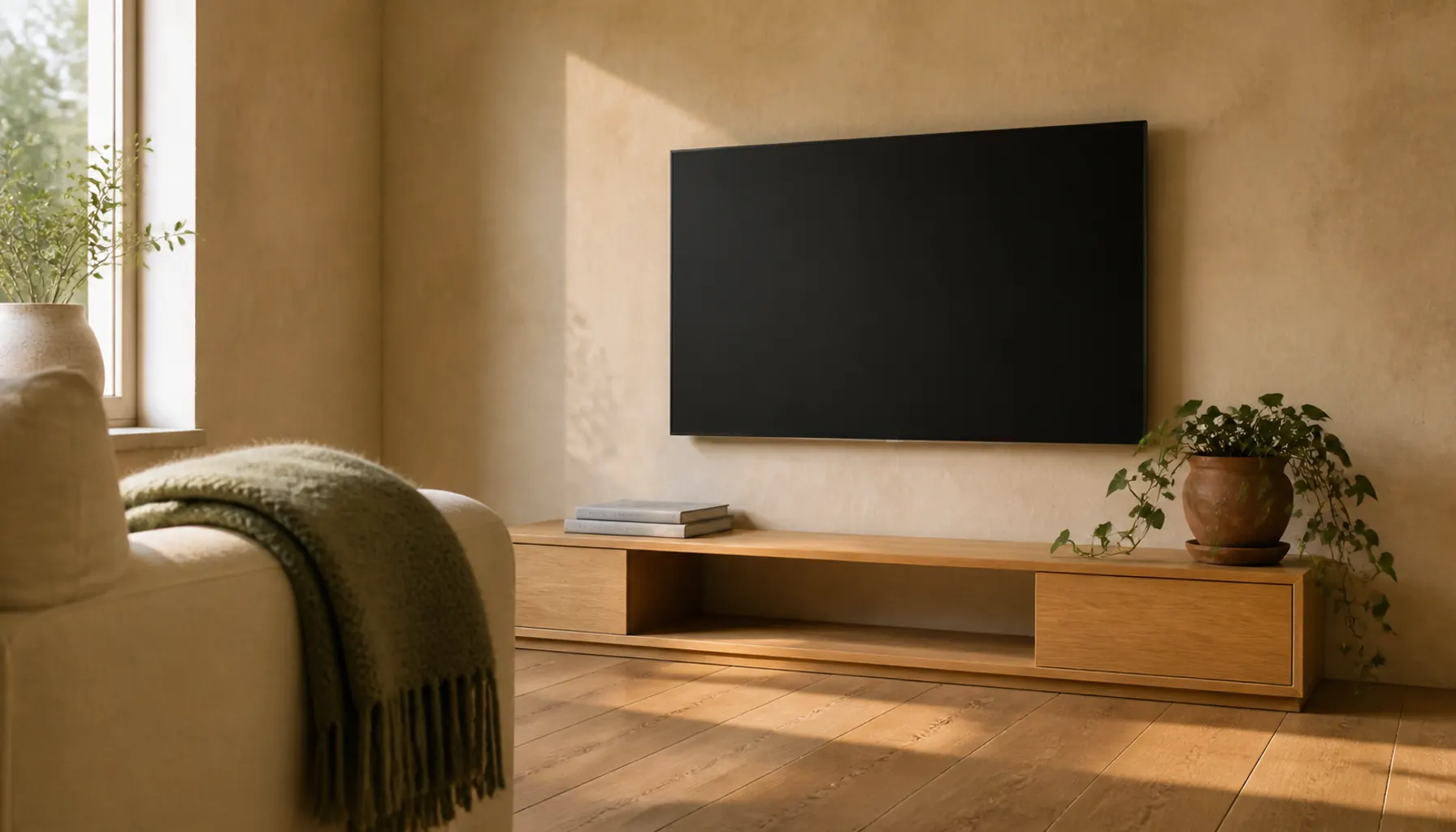
A media unit, a window seat, or shelving either side of a chimney breast are the natural candidates. Keep the back panel of open shelving in the wall color rather than olive, or everything on the shelves stops separating from the background.
Use eggshell or satin rather than matte, since cabinet fronts get touched. Pair it with aged brass or bronze pulls, not chrome. Our guide to built-in cabinet ideas for a living room covers the construction side.
Idea 8: Pair It With White Oak, Walnut, or Honey Pine
Three woods reliably suit olive, for different reasons.
White oak is pale and low in contrast, faintly cool but never blue, so olive sits on it without either color shifting. It works at any depth of olive.
Walnut is brown with a slight purple cast. Beside olive it looks richer, and it pushes olive to read greener, worth knowing if you want the green obvious rather than muted.
Honey pine and older waxed pine carry strong yellow-orange, which agrees with olive's own yellow. Keep pine to smaller pieces, or the room tips gold.
The woods to avoid are the red-leaning ones, red oak and cherry, where olive's yellow-green against their red makes both look muddy, and gray-washed or limed timber, whose cool cast drags olive toward khaki. Our guide to mixing light and dark wood furniture covers how to buffer two woods that disagree.
Idea 9: Use Aged Brass and Worn Leather as the Hard Materials
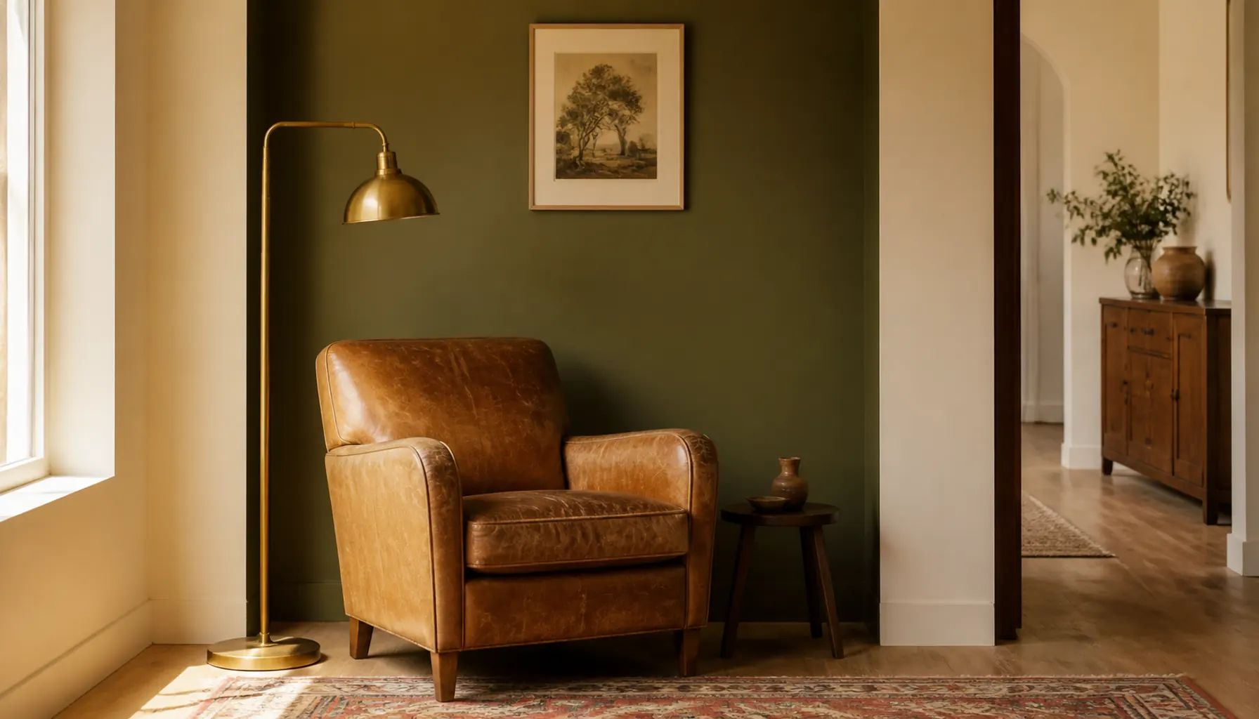
Yellow metals share olive's base, which is why aged, antique, and unlacquered brass look almost inevitable beside it. Unlacquered is worth the upkeep because it dulls unevenly and stops the room looking newly bought.
Polished chrome and brushed nickel are cool and faintly blue. Next to olive they look imported from another room. If you need something dark, use blackened steel or bronze.
Leather is the other natural partner. Tan, cognac, and mid-brown sit opposite olive on the color wheel in a dulled, well-behaved way, and worn matte leather beats anything glossy. One armchair, a strap pull, or a leather-topped stool is enough.
Be careful with a large black bonded-leather sofa under olive walls, which reads heavy with no mid-tone to bridge the two.
Idea 10: Rescue Olive in a North-Facing Room
North light is cool and flat all day. It lifts the yellow out of olive and leaves the gray behind, which is exactly why so many people describe their olive walls as muddy.
Three practical fixes. Choose an olive noticeably lighter and more yellow than the chip you liked, since the room will subtract both. Keep the deepest olive off the wall facing the window, which receives the flattest light and the least direct sun. And favor joinery, curtains, and upholstery over plaster, because those surfaces sit closer to your lamps in the evening.
Bulbs matter more than usual here. Warm white lamps put the yellow back after dark and olive comes alive. Cool daylight bulbs strip it out again, which is one of the lighting mistakes that make rooms feel cold.
Idea 11: Count Your Olive Moments and Stop at About Three
There is a point where olive stops being a choice and becomes the whole room. Walls, sofa, cushions, and rug all in olive means the objects stop separating from one another, and the room flattens into one soft mass with no focal point.
A workable ratio is one large placement, one medium, and one or two small. Large is walls, a sofa, or joinery. Medium is curtains, an armchair, or a patterned rug with olive in it. Small is a ceramic or the spine of a book left on the table.
Spread them apart and at different heights rather than clustering them on one side. And do not match olive exactly across materials. Slight differences in depth look collected; an exact match across four objects looks like a furniture set.
Idea 12: Bring In Terracotta as Fired Clay, Not as Matching Fabric
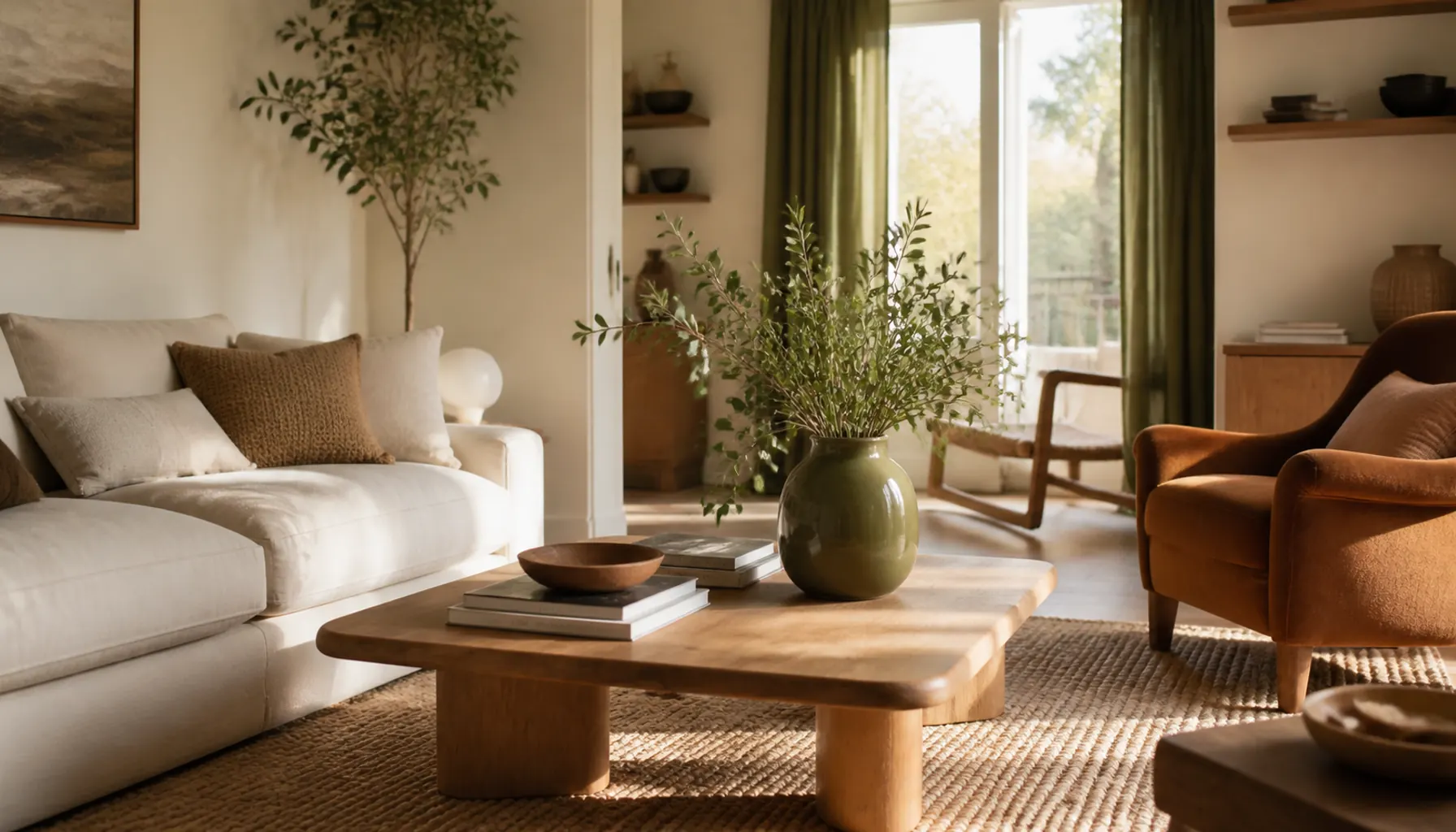
Olive and terracotta genuinely work. Red and green sit opposite each other, and once both are dulled and earthy the pairing settles instead of shouting.
The failure mode is doing it entirely in soft furnishings. Terracotta cushions plus a matching throw plus an olive wall stops looking like a room and starts looking like a bought-together color scheme.
Let terracotta arrive as actual material instead. Unglazed pots, a clay lamp base, exposed brick, a stack of books with warm red spines. The color then comes with texture attached, which is what stops it reading as flat decoration.
Keep terracotta smaller in area than the olive so one clearly leads. Plants help, since terracotta pots and green foliage do this pairing for you, and our post on styling a home with terracotta and neutrals covers the proportion in more depth.
Common Mistakes to Avoid
Buying olive from a screen. Olive is dulled with gray or brown, and screens exaggerate saturation. What arrives is nearly always flatter.
Treating olive as the accent and the neutral at once. If olive is on the walls, it cannot also be the accent. Pick a second one, usually rust, camel, or black.
Ignoring the floor. An orange-red floor under olive walls is the usual source of that vague sense something is off.
Letting olive be both the darkest and lightest thing. Olive at three similar depths has no hierarchy. Keep one clearly dark note: bronze, black metal, or walnut.
Expert Tips for Pulling the Look Together
Test olive properly, because it shifts more between daylight and lamplight than most colors. Paint two coats on a large board, then prop it against your actual sofa and floor rather than holding it up mid-air. Check it mid-morning, at four in the afternoon, and again under your lamps at night. The evening check is the one people skip and the one that matters, since warm bulbs pull olive's yellow forward.
Use two depths of olive rather than one exact shade. A lighter olive on a wall and a deeper olive on a cushion or cabinet reads as one family. A single shade repeated exactly reads as a set.
Put the darkest olive low. Olive on a base cabinet or a footstool grounds the room, while the same depth at eye level presses inward.
Repeat one non-green warm tone at least twice. Camel, tan, or rust in two or three places keeps olive from being the room's only idea, the same principle behind carrying one shared tone through connected rooms.
Frequently Asked Questions
Is olive green a warm or cool color?
Warm, in almost every version you will find. Olive is built on yellow, then dulled with gray or brown, which keeps it from looking bright without making it cool. That is why it works beside tan leather, brass, and cream. A few olives lean gray enough to read neutral, but none behave like a cool green.
What is the difference between olive and sage green?
Olive is yellow-based, mid-depth, and warm. Sage is gray-based with a hint of blue, lighter, and cool. Side by side, olive looks like it has sunlight in it and sage looks dusty. They also want different partners: sage takes cool grays and crisp whites, while olive needs cream and warm wood.
What color sofa goes with olive green walls?
Cream, oat, camel, and tan leather all sit well, since they share olive's warm base and stay lighter than the wall. Mid brown works too. Avoid a cool gray sofa, which looks blue against olive, and avoid a second green, which leaves the room with no contrast.
Does olive green go with gray?
Only carefully. Mid blue-gray and olive dull each other, because one is cool-blue based and the other yellow based. If gray is fixed in the room, push it toward charcoal or a warm greige and place a cream or camel textile between the two so they are never touching.
What curtain color works with olive green walls?
An unlined cream or oatmeal linen is the reliable answer. It keeps the window bright, shares olive's warm base, and lets the wall stay the main event. If you want the curtains to carry olive instead, keep the walls cream and hang the olive high and wide so it reads as one clean panel.
Where to Start
Look at your floor first. Its undertone decides whether olive looks settled or slightly off, and it is the one thing in the room you probably are not replacing.
If the floor leans warm and pale, you can go straight to a wall or an alcove. If it leans orange-red, keep olive off the plaster and put it into upholstery, curtains, and joinery, where a cream wall sits between the two.
Then buy the smallest useful thing: a pair of curtains, or two cushion covers in the exact fabric you would commit to. Live with it for a week. Olive is a color you decide you like in the evening, not in a shop.
One useful home email a month
Real ideas to make your home work better. No spam, easy unsubscribe.