Terracotta & Neutrals: Styling a Warm Home
A practical guide to using terracotta without turning every room orange.

· 4 min read
Terracotta is one of those colours that can make a room feel instantly lived-in and calm. It can also take over if you let it. This guide walks you through using it in a way that feels warm and considered, not loud, so your space looks collected rather than themed.
Terracotta works best with breathing room
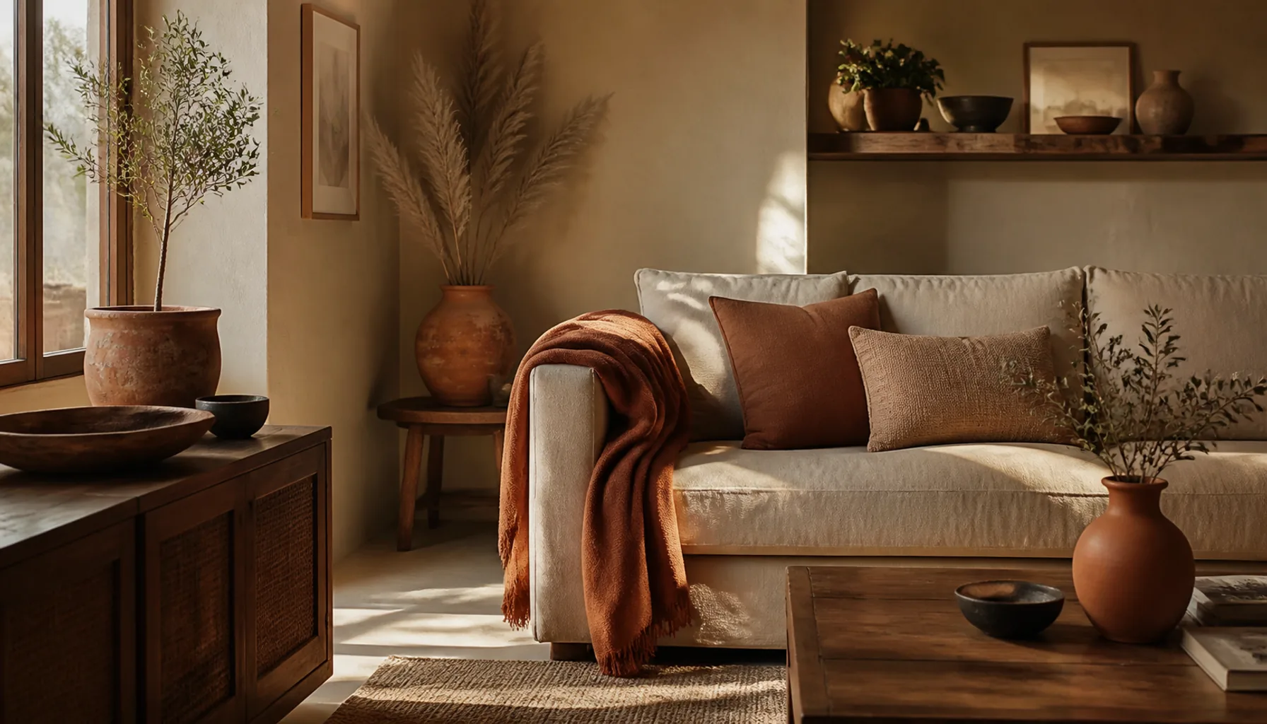
Terracotta is strong because it feels earthy and warm, almost like sun on clay. That same strength is why it gets heavy fast when everything around it is equally warm. If you stack rust cushions on a rust sofa in a room with warm-toned walls, the colour has nowhere to rest and the whole space starts to feel dense.
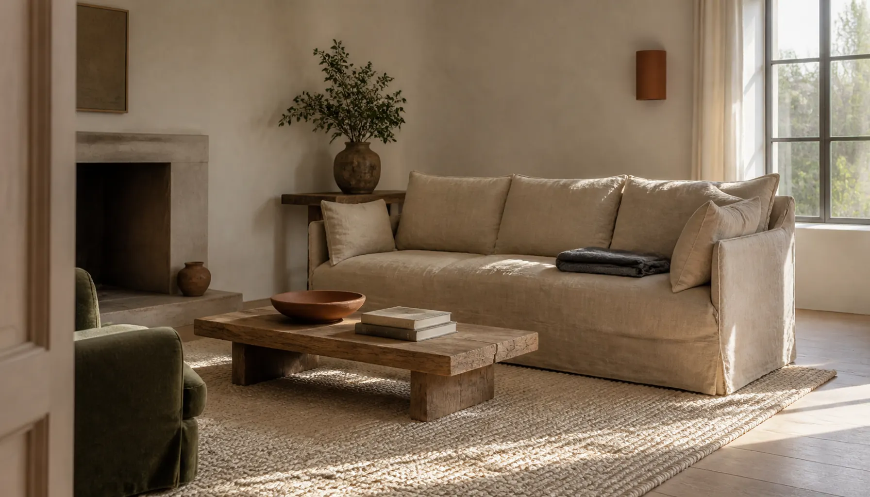
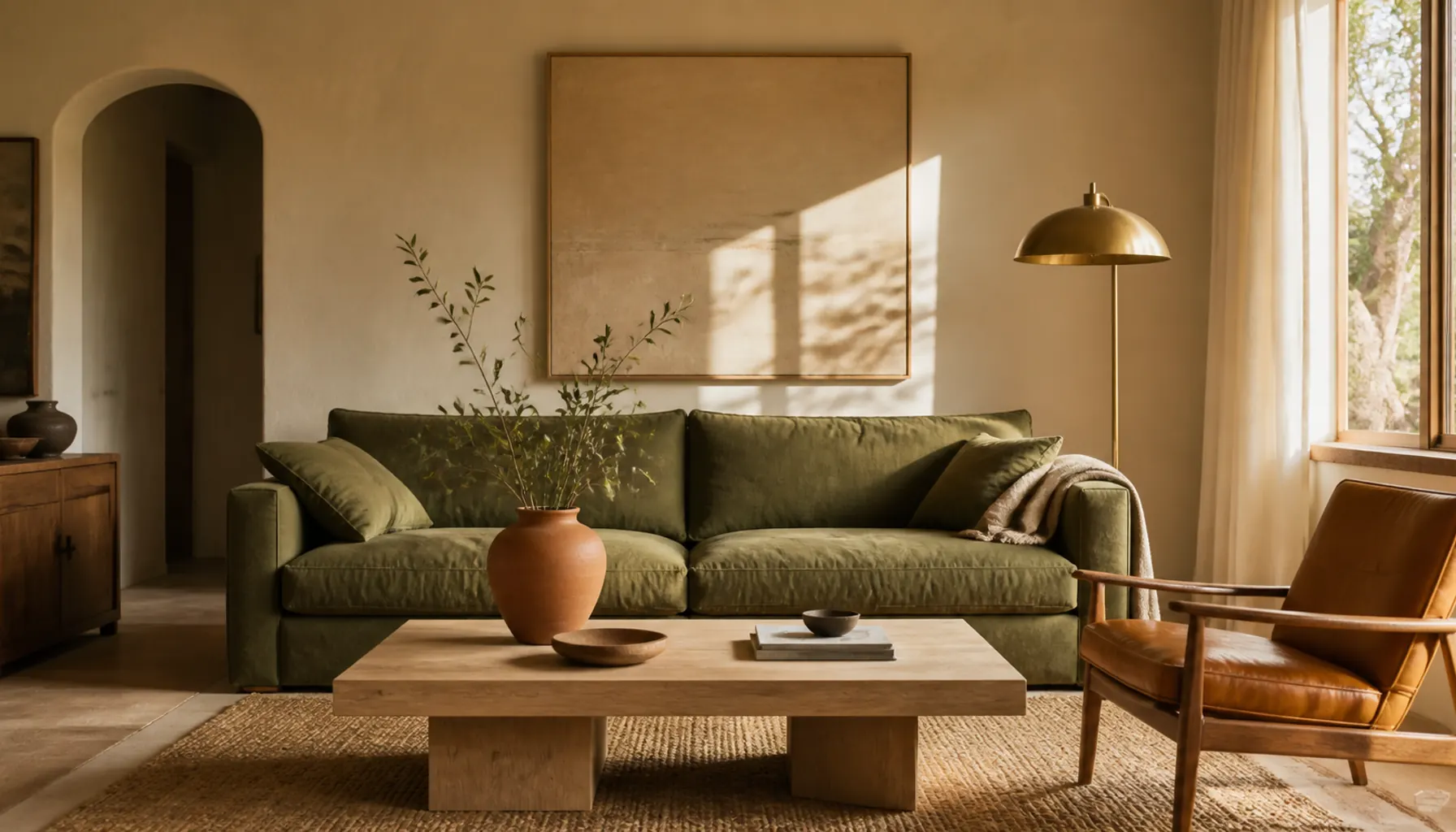
The fix is to give it quiet company. When you are building a palette around a warm accent, pair terracotta with cream, sand, oatmeal, soft white, or muted sage. These neutrals act like empty space on a page, letting the warm tone stand out because there is calm around it. Think of the neutrals as the room and terracotta as the moment you notice. A soft white wall behind a single terracotta vase reads as intentional; a terracotta wall behind a terracotta vase just reads as more.
Put it where hands and eyes naturally go
You do not need to commit to a whole wall to feel the warmth. Start where the colour is easy to add and easy to change:
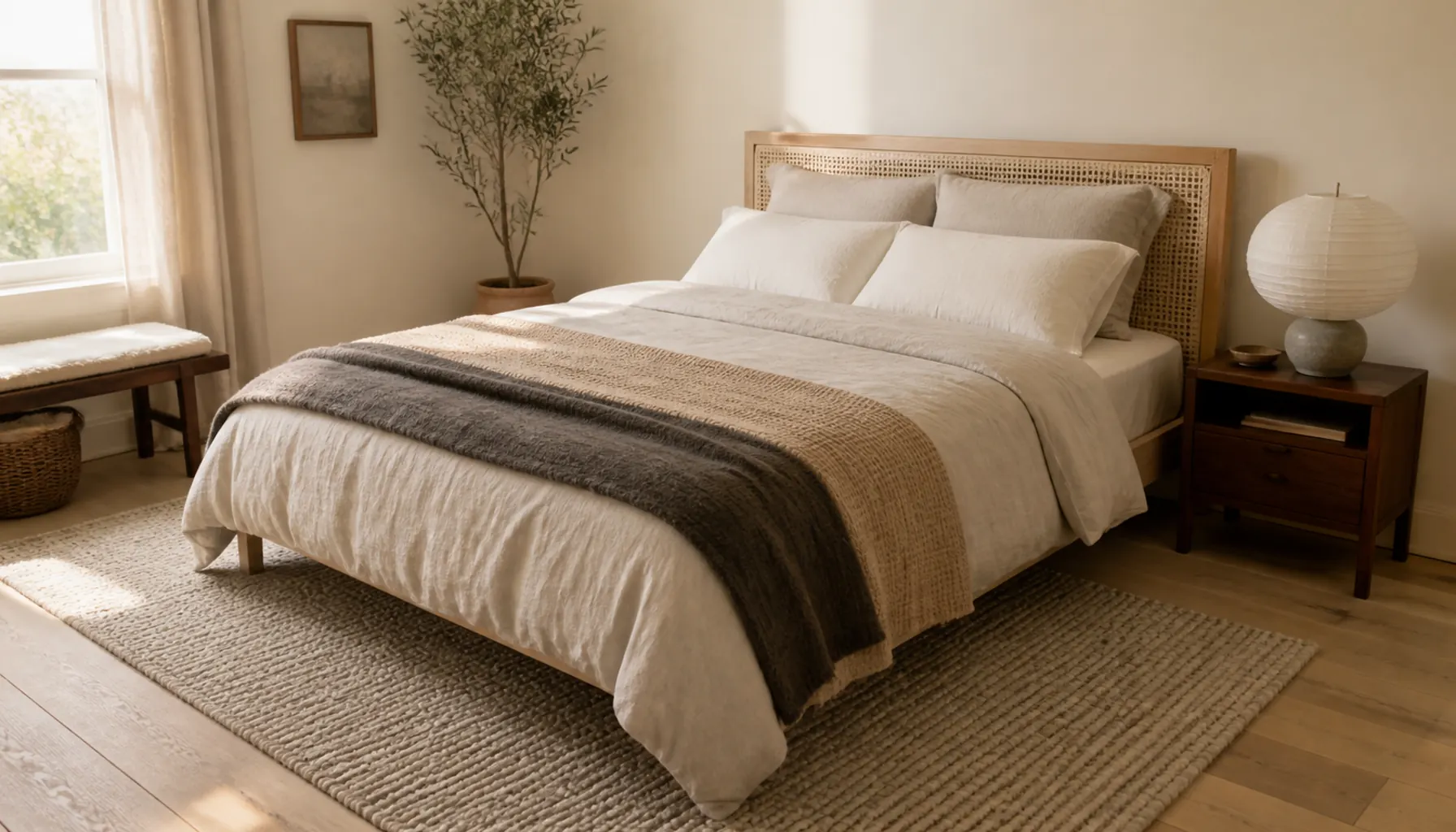
- Cushions and throws on a sofa or bed
- Plant pots, vases, and small ceramics
- Lampshades and framed prints
- A runner, a stack of bowls, or a folded blanket
These spots sit at eye level or where your hands reach, so the colour registers without dominating. Just as importantly, they are reversible. If a terracotta cushion feels like too much, you move it to another room in a minute. A painted wall is a weekend and a tin of primer. Starting small lets you live with the colour for a few days before you decide to add more, and you almost always can add more later.
Balance it with dark details
Warm palettes can drift toward sweet or dusty if every element is soft and mid-toned. A few darker anchors stop that. Espresso wood, black metal, or deep brown frames give terracotta something firm to sit against, and the contrast makes the warm tones look richer rather than faded.
You do not need much. A black picture frame, dark legs on a side table, or an iron candle holder is often enough to give the eye a resting point and a sense of structure. Without any depth, a warm room can feel like it is missing its outline; a little darkness draws that outline back in.
Avoid the showroom trap
It is tempting to buy a matching set: same shade of clay in the cushion, the pot, the tray, and the print. The result looks staged rather than gathered, as if it all arrived on the same day, because it did.
Real warmth comes from variation. Mix clay, rust, faded brick, and warm brown so the tones talk to each other instead of matching exactly. Slightly different finishes help too: a matte pot next to a glossy bowl next to a woven basket. This is how rooms look when they come together over time, and it is a large part of why they feel comfortable rather than showroom-perfect.
Try this small formula
If you want a simple starting point, use rough proportions:
- 70 percent neutral (walls, larger furniture, soft whites and sands)
- 20 percent wood or woven texture (baskets, timber, rattan, jute)
- 10 percent terracotta (the accents you actually notice)
That balance gives you warmth without overload. The neutrals carry the room, the natural textures add depth and keep it from feeling flat, and the small hit of terracotta does the emotional work. You can nudge these numbers, but keeping terracotta as the smallest share is what keeps it feeling special.
Let light and texture do part of the job
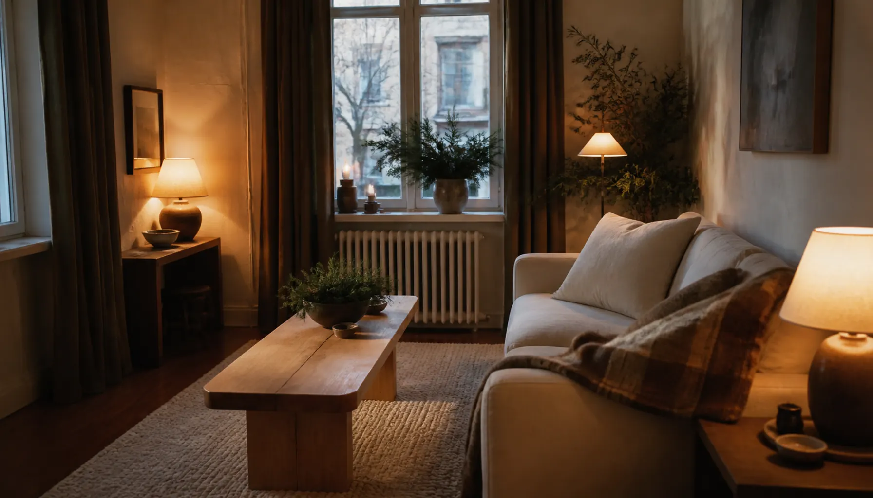
Terracotta shifts with the light around it. In warm evening light it deepens and glows; under cool daylight or bright white bulbs it can look dull or slightly pink. Before you commit, look at your accents at a few times of day and lean toward warmer bulbs if your space runs cold, since cool lighting is one of the quickest ways to make a room feel cold.
Texture matters as much as colour here, and mixing textures is what keeps a neutral base from feeling flat. Linen, wool, clay, and unfinished wood all read as warm even in neutral tones, so they quietly support your terracotta without adding more of the colour. A nubby oatmeal throw or a rough ceramic does a lot of the heavy lifting.
Start slow and let it settle
The best warm rooms are not decided in one trip. Add a couple of terracotta pieces, live with them for a week, and notice how the light and your neutrals respond. Keep what feels calm, move what feels loud, and add slowly from there. That patience is what turns a warm colour into a warm home.