12 Whole House Paint Palette Ideas for Coordinated Rooms
Build a whole house paint palette that keeps every room related without making them identical, using undertones, window direction, and sightlines.

· 14 min read
A whole house paint palette works when every room shares the same undertone but not the same color. That is the short answer, and it explains something odd: two beige rooms can look wrong side by side, while a beige room and a green room can look completely deliberate.
Most of us pick paint one room at a time. You stand in the living room, choose something you like, and move on. Six months later the hallway fights the kitchen and nobody can say exactly why.
The fix is not finding better individual colors. It is choosing a small set of colors first, then assigning them to rooms based on light, size, and what you can see from each doorway. Here are twelve ways to build that set and make it hold together.
Key Takeaways
- Start from what you are not changing. Floors, countertops, and stone set the undertone before any paint chip gets a vote.
- Give every hallway, stair, and landing one shared neutral. Circulation space is what stitches the rooms together.
- Use one trim color throughout. It is the constant that lets wall colors differ without the house reading as random.
- Assign colors by window direction, not by preference. North light and south light do different things to the same paint.
- Save your most saturated color for rooms with a door that closes.
- Test any two colors you can see at the same time, standing in the doorway between them.
- Use large samples on real walls over several days. A two inch chip has never once predicted a finished wall.
12 Whole House Paint Palette Ideas Worth Trying
Idea 1: Start With the Surfaces You Are Not Repainting
Your palette does not begin with paint. It begins with the largest thing in the house you have no intention of replacing.
That is usually the floor. It might also be a stone countertop, a fireplace surround, cabinets you like, or bathroom tile. These surfaces already carry a strong undertone, and paint either agrees with it or argues with it.
Hold your samples flat against the floor, not up against the current wall. A red oak floor pushes yellow and orange upward, so a gray with a green base will read cold and slightly dirty above it. Pale white oak is far more forgiving and sits under almost anything.
Write down what you find. "Floor leans warm orange" is a more useful starting note than a list of paint names.
Idea 2: Give Every Hallway and Stair the Same Neutral
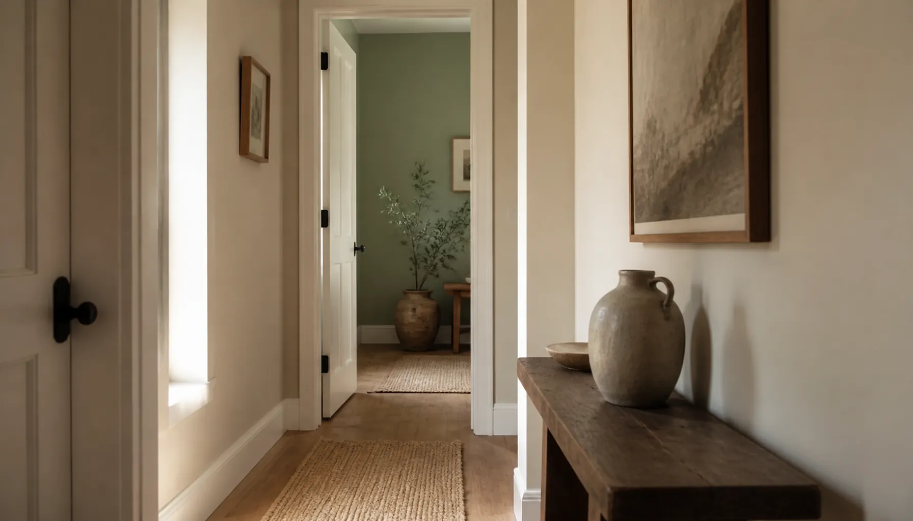
Pick one color for all your circulation space and use it without exception. Hallways, stairwells, landings, and the upstairs corridor all get the same can.
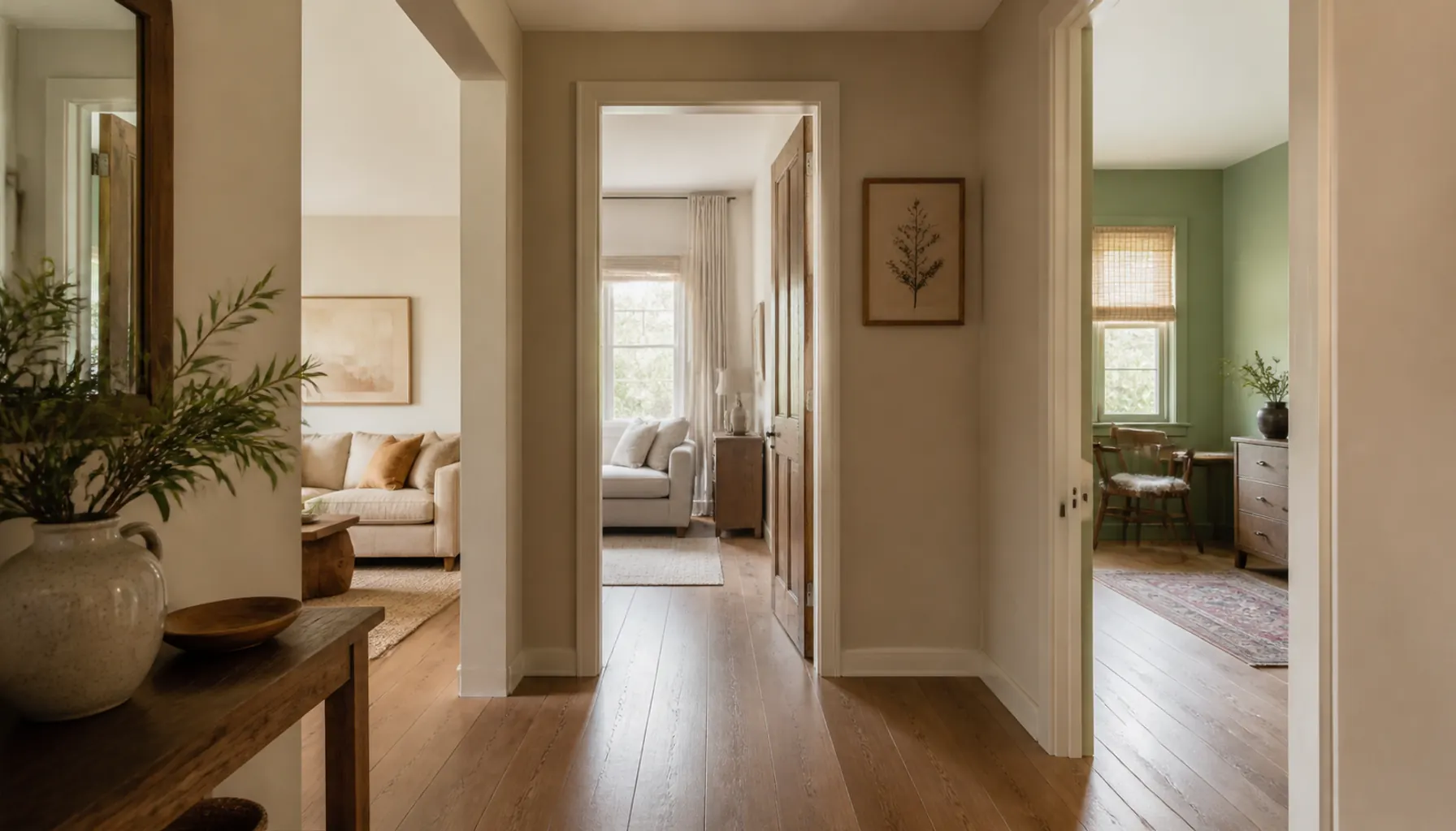
This works because you never see a hallway on its own. You see it in glimpses, framed by open doorways, sitting next to two or three room colors at once. If the hall changes color as it turns a corner, the house feels chopped up.
A single connector color does the opposite. It becomes the background that every room color is compared against, which makes even quite different rooms feel like they belong to one house.
Choose something you would describe as quiet. Soft warm white, pale mushroom, and light greige all work. The hall is not the place to be interesting.
Idea 3: Pick One Trim Color and Use It Everywhere
Baseboards, door casings, and window trim should all be the same color on every floor of the house.
Trim is the frame around everything else. When the frame stays constant, your eye reads the wall colors as intentional variations. When the trim changes too, nothing anchors the sequence and the rooms stop relating.
Most houses do better with a soft white than a bright one. Pure brilliant white next to a warm wall color can look chalky and faintly blue, especially in a north facing room. A white with a little warmth in it disappears more gracefully.
Designer Note: If your trim is a yellowed builder white and your new colors are cool, repaint the trim first. Aged trim makes fresh wall paint look wrong, and people almost always blame the wall.
Idea 4: Keep Every Color in the Same Undertone Family
This is the one idea that fixes most palettes. Every color in the house should share an undertone, even when the colors themselves look nothing alike.
Undertone is the quiet color sitting underneath the obvious one. A beige can have a pink base, a yellow base, or a green base. A gray can lean blue, violet, or green. Two colors with the same name behave like strangers if their undertones disagree.
So instead of collecting colors you like, pick a base and stay in it. A green based family might run from a warm off white through pale sage to deep olive. Those are all different, and they get along, because the same green is threaded through each.
This is why our guide to building a color palette for a small living room starts with one main color and two helpers rather than a mood board of favorites.
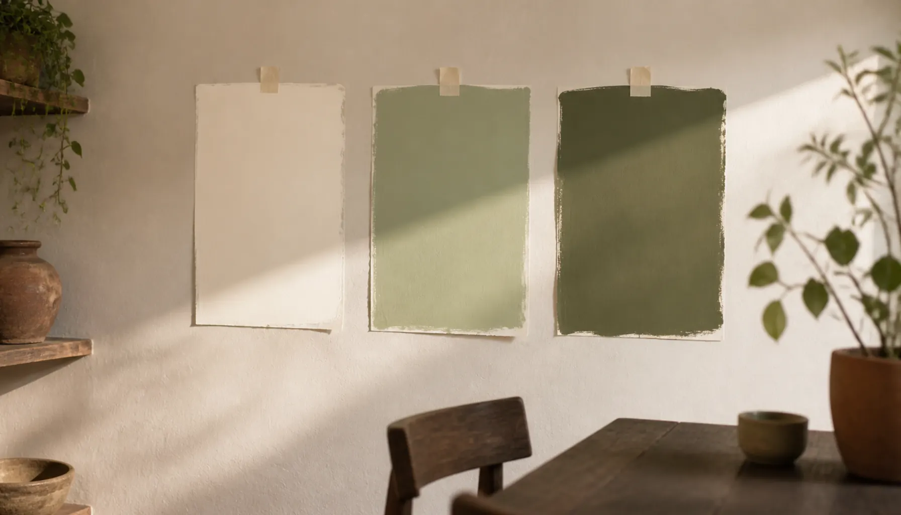
Idea 5: Let Window Direction Decide Which Room Gets Which Color
Once you have a family of colors, do not assign them by taste. Assign them by which way the windows face.
North facing rooms get cool, flat light all day. That light drains warmth out of paint, so a color that looked soft on a sample can turn gray and slightly sad on the wall. Give these rooms the warmest members of your palette.
South facing rooms get strong warm light for hours. They carry your cooler, grayer colors without going cold, and a very warm color there can tip into looking yellow by mid afternoon.
East rooms are warm in the morning and cool by evening. West rooms do the reverse and can glow orange at the end of the day. For both, pick from the middle of your palette rather than the extremes. Light behaves in ways most people underestimate, which is the thread running through our piece on the lighting mistakes that make rooms feel cold.
Idea 6: Spread the 60/30/10 Split Across the Whole House
The usual advice is to balance colors inside a single room. Try applying the same proportion to the floor plan instead.
Roughly sixty percent of your rooms get the dominant neutral. About thirty percent get the secondary color, usually a step deeper or slightly more saturated. The last ten percent, meaning one or two rooms, get the accent.
In a three bedroom house that might look like this. The hall, living room, main bedroom, and landing take the dominant neutral. The kitchen and second bedroom take the secondary. The study takes the accent.
You end up with a house that has real variety but still feels settled, because most of what you see is one color.
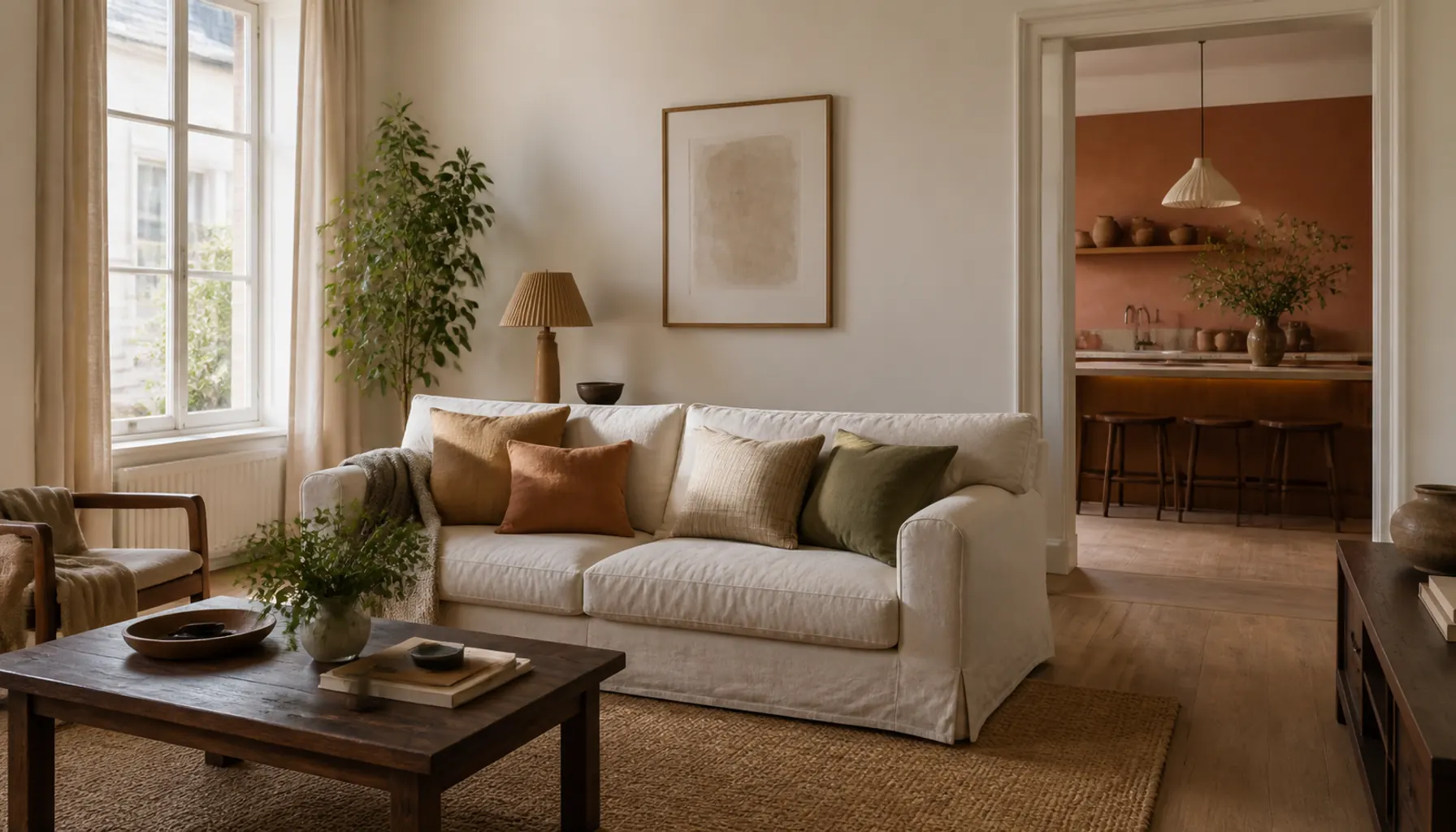
Idea 7: Save Your Boldest Color for Rooms With a Door
Strong color belongs where you can shut it away from everything else.
A powder room, study, laundry, pantry, or small guest bedroom can all take a deep, confident color. These rooms are small, they get used briefly or with the door closed, and they do not sit inside a long sightline from the rest of the house.
Put that same deep color on one wall of an open plan living space and it stops being a decision about that room. It becomes a color you see from the kitchen, the hall, and the top of the stairs, and it has to work with all of them at once.
Budget Alternative: A small enclosed room is also the cheapest place to be brave. A powder room often takes under a quart of paint, so a color that turns out to be a mistake costs you an afternoon rather than a weekend.
Idea 8: Run the Doorway Test on Every Pair of Colors
Stand in every doorway in the house and look both ways. Any two colors you can see at the same time have to work as a pair.
This sounds obvious and it is the step almost everyone skips. Palettes get chosen room by room, on a table, in daylight. Houses are experienced in overlapping views, through openings, in mixed light.
Walk it properly. From the hall you might see the living room, the kitchen, and a slice of the stairs at once. That is a four color combination, not three separate decisions.
Where a pair does not work, you often do not need a different color. You just need to swap which room gets which color from the set you already have.
Idea 9: Repeat One Color at Two Different Strengths
Take one color from your palette and use it twice at different intensities. Many paint lines make this easy by offering the same pigment at different percentages.
A pale sage in the living room and the full strength version of that sage on a study wall will read as connected, even in rooms you never see at the same time. The eye recognizes the relationship without being able to name it.
This gives you the depth of a bolder scheme without adding another color to track. It also solves a common problem, which is that three neutrals alone can end up feeling flat. Our post on styling a home with terracotta and neutrals shows the same principle in a warmer register.
Idea 10: Change the Sheen, Not the Color, Room to Room
Kitchens and bathrooms need a more durable finish than bedrooms. That is a reason to change the sheen, not the color.
The same color in matte, eggshell, and satin looks slightly different, because a shinier surface bounces more light and reads a touch lighter and cooler. Use that on purpose. Your dominant neutral can run through the house in matte, then continue into the kitchen in eggshell and the bathroom in satin.
You get a wipeable surface where you need it and the palette stays intact. Hunting for a separate kitchen color that coordinates with everything else is a much harder job for no real gain.
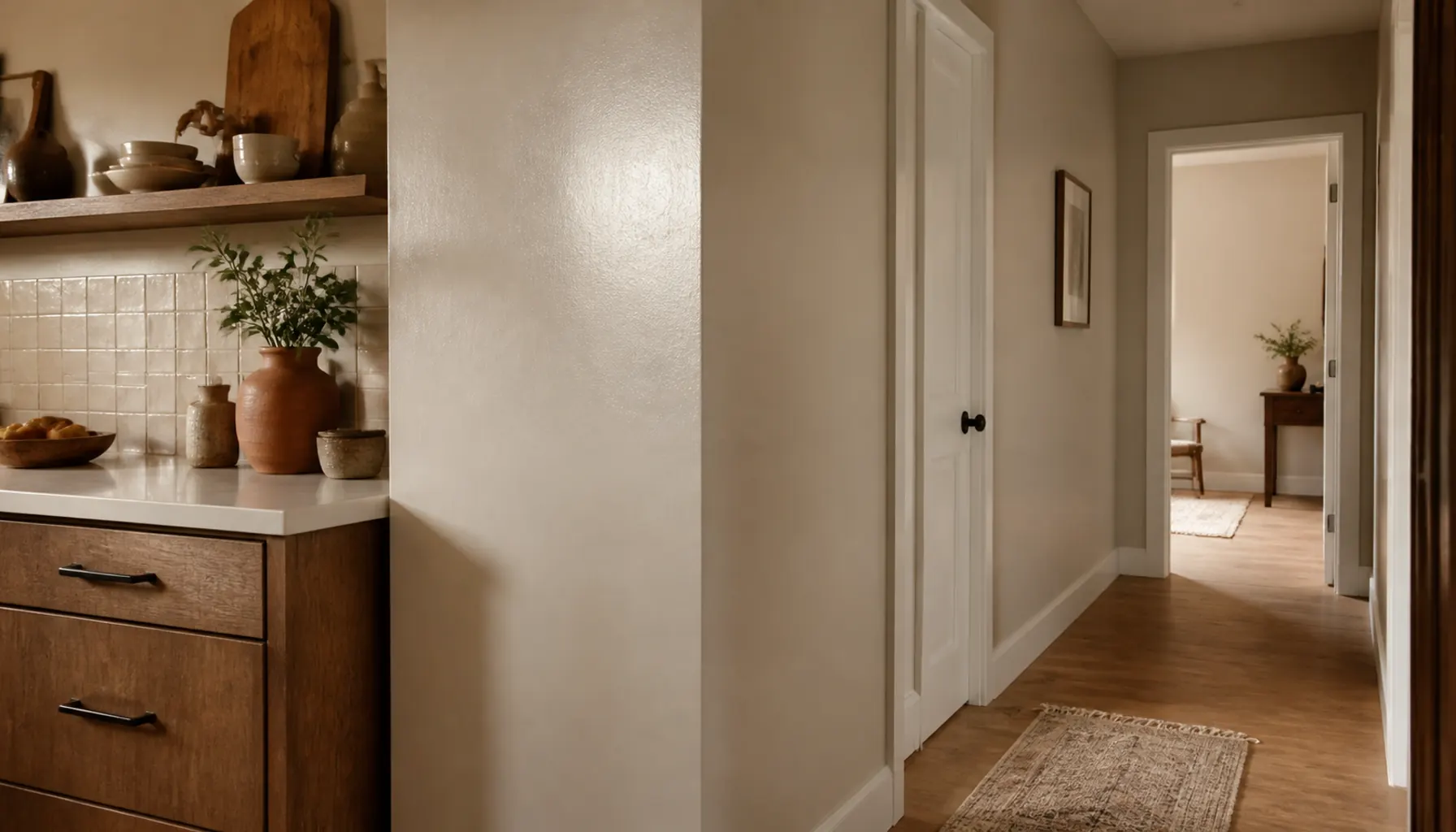
Idea 11: Decide the Ceilings Once
Ceilings are the easiest place to lose the coherence you just built. Make one decision and apply it everywhere.
The straightforward route is a single soft white on every ceiling. It is predictable, it makes rooms feel taller, and it never competes with the walls.
The more interesting route is to have each ceiling mixed at about a quarter strength of that room's wall color. The ceiling then reads as a very pale version of the wall, the corner between them softens, and a low ceiling feels less like a lid. This works especially well with sloped or awkward ceilings.
What you want to avoid is doing both in different parts of the house. Pick one approach and see it through.
Idea 12: Test Big Samples in Place Before You Commit
Paint two coats onto poster sized boards, or straight onto a patch of wall about two feet square. Then live with them.
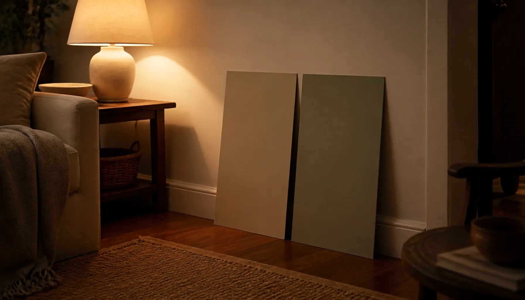
Move each board around the room over two or three days. Look at it in morning light, in the afternoon, and under your lamps at night. Hold it in the corner where two walls meet and the color doubles up, and next to the trim color you picked.
Then carry the board into the next room and check it there. This is how you catch the problem that only shows up in the hall, and a few dollars of sample pots is nothing against repainting, which fits the approach in our room refresh on a real budget plan.
Common Mistakes to Avoid
Choosing colors in the store. Paint displays use bright, neutral, overhead light that exists nowhere in your house. Take samples home and decide there.
Matching instead of relating. Making the kitchen match the living room usually produces two rooms that are almost the same, which reads as indecision. Related is the goal. Identical is not.
Forgetting the view through the door. If you can see three rooms from the bottom of the stairs, you have chosen a three color combination whether you meant to or not.
Letting the trim date the scheme. Fresh wall color against yellowed trim makes the new paint look wrong. If the trim has aged, it needs doing too.
Treating a feature wall as a room decision. In an open plan space, one bold wall belongs to every room that can see it.
Expert Tips for Pulling the Look Together
Repeat your accent color in something small in at least two other rooms. A cushion, a vase, or a stack of books is enough to make the accent feel planned rather than stranded.
Match undertone rather than color when coordinating with fabric or wood. A curtain does not need to be the same color as the wall, but a green based wall and a pink based curtain will quietly disagree. That is the same logic behind balancing light and dark wood furniture in one room.
Keep one surface as the darkest thing in each room, and stay consistent about which surface that is. If floors are darkest downstairs, do not suddenly make walls darkest upstairs.
Where two rooms meet with no door, stop the color change at an inside corner rather than mid wall. The corner gives the eye a reason for the change.
Bring in texture where you have kept color quiet. A restrained palette needs surface variety to stay interesting, which is what our beginner's guide to mixing textures is built around. The same goes for window treatments, which cover a large area and carry their own undertone.
Frequently Asked Questions
How many colors should a whole house palette have?
Three to five is plenty. A dominant neutral, one trim color, a secondary wall color, and one or two accents will cover a whole house. Fewer than three tends to feel flat, and more than five gets hard to keep coherent across sightlines.
Should every room in the house be the same color?
No, and it usually backfires. One color everywhere flattens the differences between rooms and makes the light in each look uneven rather than deliberate. Share the undertone across rooms and vary the color itself.
How do I pick paint colors that work with wood floors?
Identify the floor's undertone first, then choose paint from the same family. Red and orange toned floors like red oak sit best under warm whites, creams, and greens. Cooler floors such as pale white oak or gray washed boards take a much wider range.
Can I use dark colors in a small house?
Yes, in rooms that close. A deep color in a small enclosed space feels considered rather than cramped, because the room reads as its own pocket. Avoid dark colors on walls inside a long open sightline, where they will dominate several rooms at once.
What if I already painted rooms in unrelated colors?
Start with the connectors. Repainting hallways, stairs, and landings in one shared neutral pulls a mismatched house together faster than repainting any single room. Then change individual rooms over time as budget allows.
Where to Start This Weekend
Pick the floor, or whichever large surface you are keeping, and work out its undertone. Everything else follows from that one observation.
Then choose your connector neutral and your trim color, because those two decisions do most of the work. Individual room colors get easier once the constants are set, and you can add them gradually rather than committing to the whole house at once.
Buy samples for the connector and the trim first, paint two large boards, and carry them room to room for a few days. If those two colors look right everywhere, you have a palette. The rest is assignment.