14 Warm Industrial Living Room Ideas With Wood and Wicker
Warm industrial living room ideas that keep blackened steel, brick, and concrete from feeling cold, using rough timber, wicker, leather, and aged brass.

· 14 min read
Industrial rooms go cold for one reason: the hard materials outnumber the soft ones. Steel, brick, concrete, and glass are all smooth, cool to the touch, and good at bouncing sound. Put four of them in one room and it feels like a workshop no matter how many cushions you add.
Warm industrial fixes that with a ratio rather than a style rule. The blackened metal and exposed masonry stay. Rough timber, wicker, leather, and wool go in around them until the warm materials clearly win.
These fourteen ideas cover where black metal belongs, which wood tones hold up against it, why wicker beats baskets, and what to do about brick and concrete you cannot change.
Key Takeaways
- Aim for roughly two parts warm material to one part hard material. Count large surfaces, not accessories.
- Put the black metal in structural things: shelf uprights, table legs, window frames. Scattered black accessories look speckled, not deliberate.
- Wood should read rough, not polished. Saw marks, knots, and thickness separate warm industrial from generic modern.
- Wicker and rattan need to be furniture-sized to register against a brick or concrete wall. Baskets are too small.
- Keep one dominant metal and one warm accent. Matte black plus aged brass works. Adding chrome breaks it.
- Matte walls make metal look sharper. Limewash, clay plaster, or flat paint beat eggshell.
- Cognac leather beats black in a room that already has black steel.
14 Warm Industrial Living Room Ideas Worth Trying
Idea 1: Set the Warm-to-Hard Ratio First
Before buying anything, sort the room's large surfaces into two piles. Hard and cool: concrete, brick, steel, glass, stone, tile. Warm and soft: timber, leather, wool, linen, wicker, plaster.
You want roughly two thirds of the visible surface area in the second pile, and that includes the floor and walls, which is where most people lose the count. A room with a concrete floor, one brick wall, and steel shelving has used up its allowance before any furniture arrives, so the furniture has to be almost entirely warm.
The reverse holds too. Over a wide-plank oak floor with plaster walls, you can afford a steel and glass coffee table, a metal media unit, and cage lighting without the room going cold.
Idea 2: Give the Black Metal a Structural Job
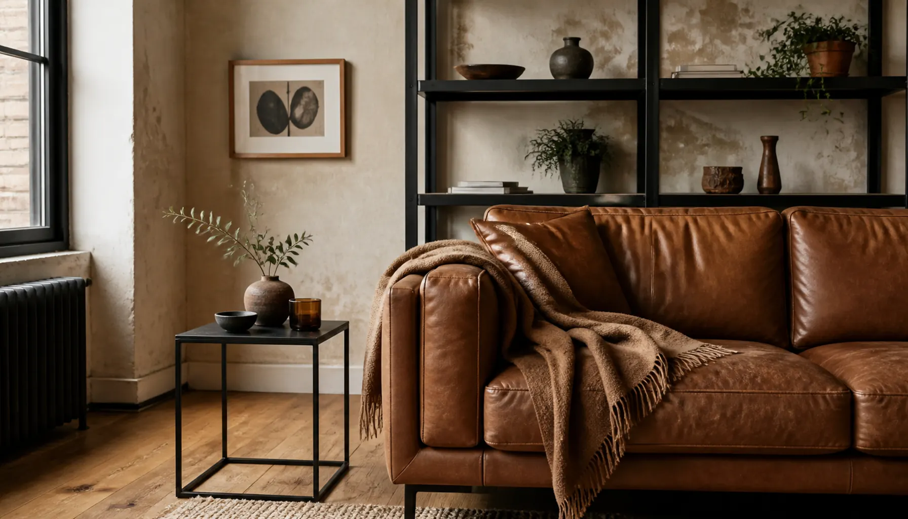
Blackened steel looks right when it appears to be holding something up. Shelf uprights, table legs, a stair rail, a slim floor lamp stem, window mullions, a cabinet frame.
Sprinkling the same black across small objects does the opposite. Black frames, a black vase, and a black tray read as dark spots scattered over a room, not as structure. Pick two or three elements that carry weight and let them do all of it.
Finish matters as much as placement. Gloss black looks lacquered; matte, gunmetal, or a slightly uneven powder coat reads as raw metal. Darkening an existing piece? Flat or satin spray paint over lightly sanded metal gets far closer than gloss.
Idea 3: Pick Rough-Sawn Timber Over Furniture-Smooth Wood
The wood in these rooms should look like it came from a building, not a showroom. Saw marks left visible, knots that were not filled, and a top thick enough to cast its own shadow line.
Reclaimed scaffold boards, old joists, and barn timber all have that quality. A veneered panel does not, because the grain is printed flat and light hits it evenly.
Keep the tone warm. Honey oak, aged pine, and walnut lean golden or red, which is what you need beside cool gray steel. If you already own mixed pieces, our guide to balancing light and dark wood furniture covers making them agree.
Finish rough timber with a hardwax oil or matte sealer. High-gloss varnish over saw marks looks like a copy of the real thing.
Idea 4: Make Wicker and Rattan Furniture, Not Accessories
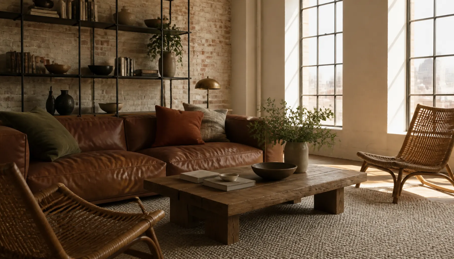
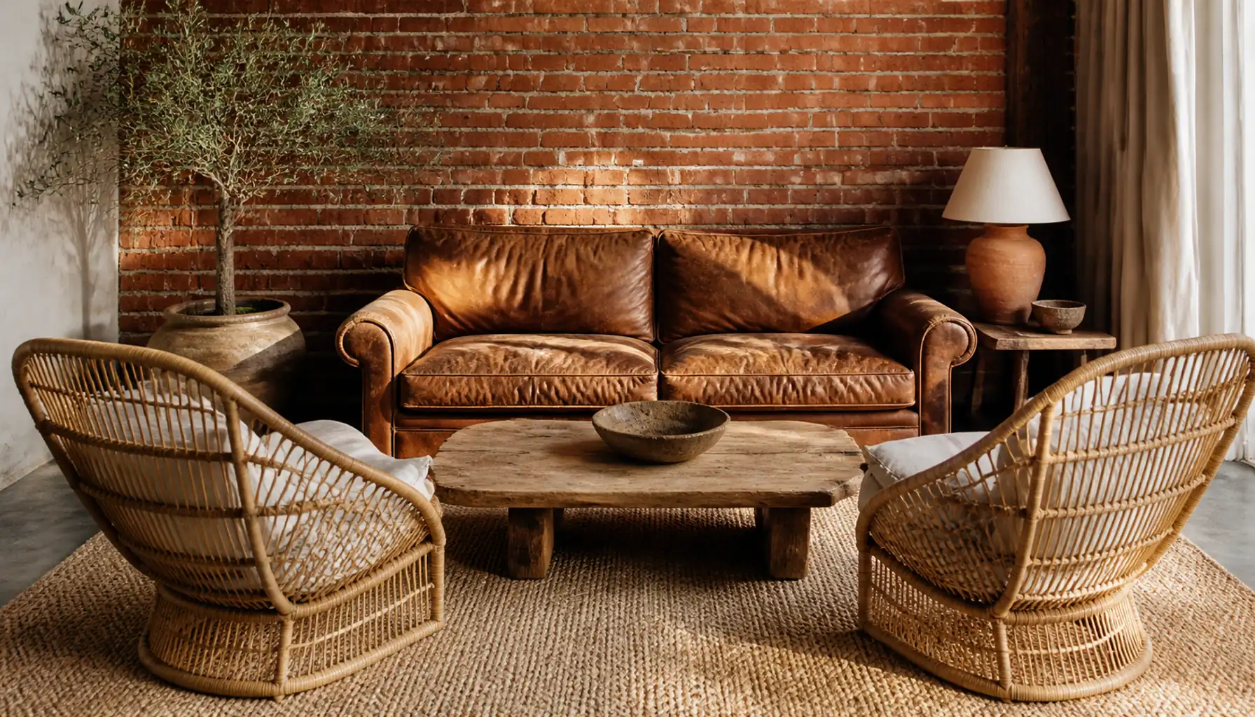
Wicker is the counterweight that stops the scheme reading as a warehouse, and it only works at scale. A pair of rattan lounge chairs facing a leather sofa changes the room. Three baskets under a console do not.
Two things make it effective. The open weave is visually light, so a chair with real presence still lets you see through it, which keeps a heavy sofa and a metal shelf from crowding each other. And the pale straw color lifts a room where walls, floor, and metal all sit mid to dark.
Look for wide seats, deep frames, and either natural cane or a dark stained rattan. Spindly frames tip the room toward patio furniture. Secondhand is worth checking, since older rattan is usually built heavier than new budget versions.
Idea 5: Choose Leather That Is Allowed to Age
Full grain and semi-aniline leathers keep their natural surface, so they darken, soften, and pick up a sheen where people sit. That change is most of the warmth. Pigmented corrected-grain leather stays perfectly uniform, and uniform is what makes cheap leather look like plastic.
Color is a real decision. In a room that already has black steel and dark window frames, black leather swallows light. Cognac, tobacco, and chestnut sit closer to the timber and read warm at a glance.
The tradeoff is wear. Full grain marks easily and lightens on the arms. If that would bother you, pick wool or a heavy cotton instead.
Budget Alternative: A secondhand leather armchair has already done the aging you would pay extra for. Scuffed arms and a sunken seat are the goal, not a flaw, and our notes on thrift furniture worth flipping cover which frames are worth the gamble.
Idea 6: Hang Factory Lighting, Then Size It Up
Enameled dome pendants, cage guards, and ribbed glass shades are the clearest industrial signal in a room, and almost everyone buys them too small. A shade roughly a third the width of the table or seating group below looks intentional. Anything smaller floats.
A spun metal dome with a pale enamel interior throws light down in a tight pool, which is useful over a coffee table and useless as the room's only light source. Plan a lamp or two alongside it.
Bare filament bulbs at eye level glare, so pick a shade deep enough to hide the bulb or put it on a dimmer. And keep the bulb warm; cool white turns the same fixture into office lighting, which is one of the lighting mistakes that make rooms feel cold.
Idea 7: Run One Warm Metal Against the Steel
Aged brass or unlacquered copper beside blackened steel gives the room a temperature shift. Keep the structure black and let the warm metal appear in smaller pieces: a table lamp, a picture light, cabinet pulls, a shallow copper tray.
Stop at two metals. Black plus brass reads as a decision; add chrome and the eye can no longer tell which metal is the accent.
Unlacquered brass and raw copper darken with handling, so they age on the same timeline as the leather and the timber. Skip bright polished gold. Against raw steel it looks dressed up for a different room.
Idea 8: Warm Up Exposed Brick Instead of Sealing It Shiny
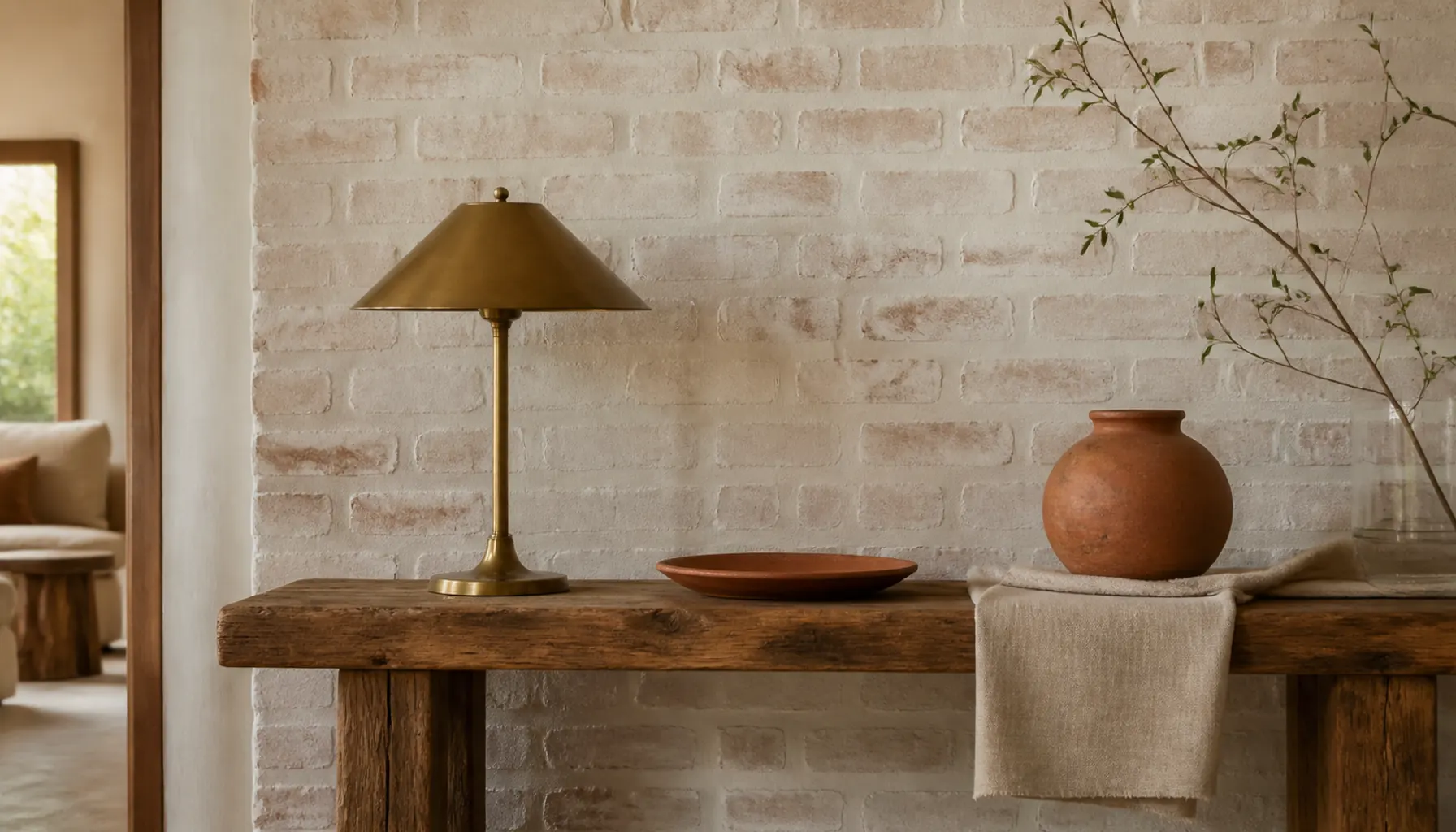
If you have brick, the finish decides whether it reads warm or wet. Glossy masonry sealers leave a plastic sheen that flattens the texture. A matte or penetrating sealer holds the dust down and still looks like brick.
Harsh orange-red brick is the other common problem. A thinned limewash or mortar wash lets some original color through while knocking the intensity back toward clay. Test a hidden section first, since the effect varies with how porous the brick is.
No brick? A single wall in a warm charcoal or clay tone does the same grounding job, and it is one of the paint tricks that change a room completely.
Idea 9: Break Up Concrete and Stone With Wool
Hard floors and stone surfaces feel cold partly because of temperature and partly because of sound. Smooth masonry reflects it, so the room picks up a slight echo that registers as unfinished.
Wool pile does more here than a flat weave. It absorbs sound, holds heat, and gives the eye a different surface beside polished concrete. Jute and sisal are coarser and cheaper but scratchy underfoot, so put wool where you sit and jute in the walkway.
Size makes or breaks it. A rug that stops short leaves concrete framing the furniture, so check the coverage rules in our guide to choosing and sizing a rug. Fold a chunky wool throw over one arm of the leather sofa while you are at it.
Idea 10: Keep the Walls Matte So the Metal Reads as Metal
Limewash and clay plaster give walls a mottled, slightly cloudy surface that absorbs light instead of bouncing it. Against that, matte black steel and glass look sharper, because the wall is not competing for reflection.
Eggshell and satin do the reverse: their low shine makes the room read evenly lit, and the metal loses its edge.
Warm off white, mushroom, and pale clay all work as the base. Each has enough yellow or red to keep gray steel from pushing the room blue, the same undertone logic behind choosing a color palette for a small living room. If plaster is out of reach, flat matte paint in one of those tones gets most of the effect.
Idea 11: Build Pipe or Scaffold Shelving, Then Leave Gaps
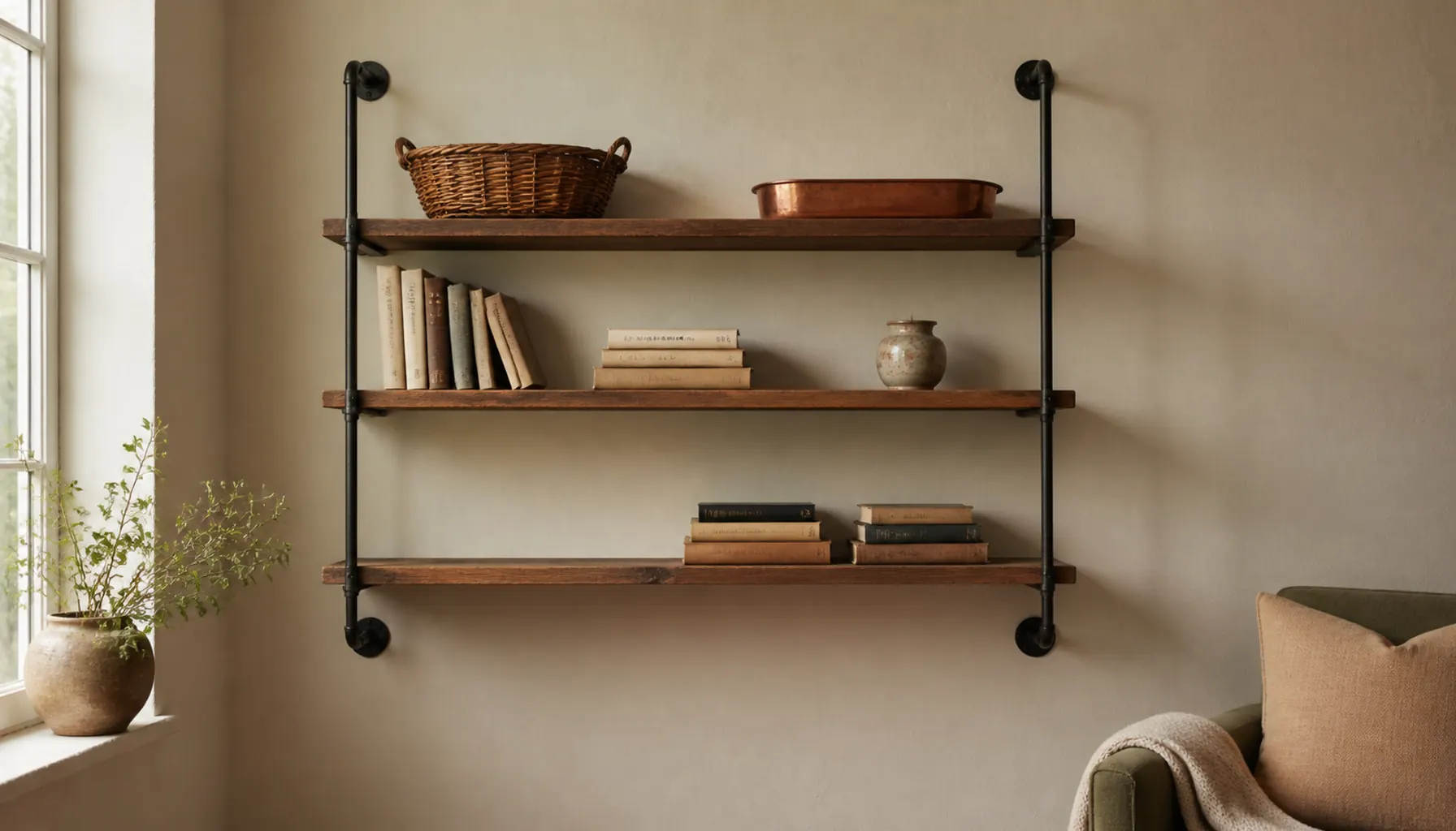
Black iron pipe with threaded fittings, or scaffold boards on heavy steel brackets, gives you storage that looks structural rather than bought. Both are within reach for a first build.
Anchor into studs, not drywall plugs. Boards and books add up fast, and a shelf that sags in the middle ruins the straight lines the whole thing depends on.
Keep the boards shallow enough that you cannot double-stack, and fill them to about two thirds. Sparse shelving reads as deliberate; packed shelving reads as a garage. Group in threes and leave one shelf nearly empty. There is more on styling open shelves if yours fill up.
Idea 12: Go One Size Up on the Main Seating
Industrial furniture was proportioned for tall spaces, which is why a correctly sized suburban sofa looks lost against a brick wall. Deep seats, low backs, and wide arms give you that weight even under standard ceilings.
Depth and a low profile do the work here, not height. A sofa that sits low and runs deep feels substantial without shrinking the wall above it, which leaves the upper half of the room for shelving and lighting.
Small rooms benefit more than you would expect. One large piece plus two visually light pieces (a rattan chair, a metal and glass side table) reads calmer than four medium pieces fighting over the floor. Size the rug and coffee table up to match, or the sofa looks stranded.
Idea 13: Treat the Windows as the Largest Black Element
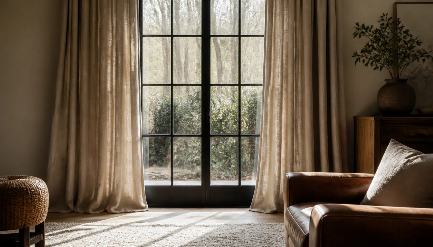
Dark window frames are the strongest industrial feature most rooms already have, and they are free. A steel or black-painted grid against daylight becomes the focal point with nothing else on that wall.
Curtain them in heavy linen in oatmeal, flax, or soft camel. The slubby, uneven weave is the opposite of a hard steel grid, which is the contrast you want. Hang the rod close to the ceiling and wide enough that the fabric clears the glass when open. Shiny fabrics and stiff blackout liners fight the look, and our window treatment guide covers hanging heights.
Renter Fix: With white vinyl frames you cannot repaint, a slim black rod with black rings gives you a dark line across the top of the window instead. Pair it with a black-framed mirror on the facing wall, along the lines of these renter-friendly upgrades.
Idea 14: Work Real Utility Objects In as Furniture
A wooden workshop stool as a side table. A factory cart as a media base. A metal locker for storage, a crate for records.
Salvaged pieces carry wear that new industrial-style furniture only imitates: worn edges, layers of old paint, hardware that does not match. One or two do more for the room's credibility than a full set of reproductions.
Check the practical details before buying. Cart casters should lock, or the coffee table shifts every time someone sets a glass down. Old carts also sit higher than a coffee table, which makes them better as a console or media unit. Wax or seal bare metal so rust does not transfer onto a rug.
Expert Tips for Pulling the Look Together
Repeat the black at three heights. Low in a table base, mid in a chair frame, high in a pendant or shelf bracket. One black element at a single height looks like an orphan; three make the metal read as a thread through the room.
Keep the metal finishes consistent. Matte black, oil-rubbed bronze, and gunmetal each pass as "black" alone, but side by side they look like three failed attempts to match.
Let one warm material dominate and use the second as contrast. If timber is doing the heavy lifting, keep wicker to two pieces.
Anchor the palette in five tones and stop: charcoal, cream, camel, terracotta, and a muted sage. The first two carry the room and the rest appear in textiles and pottery, the same restraint behind terracotta and neutrals in a warm home.
Leave empty wall around the shelving. Industrial elements need air to read as architecture.
Frequently Asked Questions
Can warm industrial work in a small living room?
Yes, and it often looks better small because the materials do the work instead of the square footage. Keep the hard materials to one or two elements, usually shelving and lighting, and put the warmth in the floor, walls, and seating. Choose one large upholstered piece over several medium ones, and use open frames and rattan you can see through.
What colors keep an industrial room from looking cold?
Warm neutrals with visible yellow or red in them. Cream, mushroom, and pale clay on walls, camel and oatmeal in textiles, terracotta and rust in pottery. Avoid true grays and cool whites, which pick up the blue in steel and concrete and push the room cooler. One muted green works as the only non-neutral.
Is warm industrial renter friendly?
Mostly. Lighting, furniture, rugs, curtains, and salvage pieces all move with you, and those carry most of the style. What you cannot do is expose brick or replace windows. Substitute a matte charcoal or clay accent wall for masonry, freestanding pipe shelving for built-in steel, and heavy linen curtains to soften whatever windows you have.
How much black metal is too much?
Once black stops looking like structure and starts looking like a pattern of dark spots, you have gone too far. A practical check: if you can point to more than four black objects that are not holding anything up, remove some. Black in legs, frames, and fixtures can be generous. Black in accessories should be almost nonexistent.
Where to Start
Work out which side of the ratio your room is already on. Count the hard surfaces, strictly including the floor and walls. That count tells you whether you are shopping for warmth or free to add metal.
If the room leans cold, the cheapest fixes are a large wool rug and heavy linen curtains hung high, since they cover the most area for the money. If it leans soft and shapeless, one piece of structural black metal gives it the edge it is missing.
Then add the wicker. It is the piece people skip, and it is why some industrial rooms feel like homes while others feel like offices with nice chairs.